Who is Right – Bonds & USD or Shares?
News
|
Posted 04/04/2019
|
5058
There is a stark contrast in signals from the world’s largest markets going on right now. On one hand we have the S&P500, the world’s biggest sharemarket index on a tear since its 20% correction late last year.
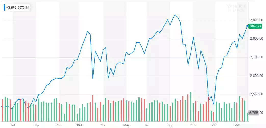
That would, ordinarily, indicate everything is awesome. The world’s biggest economy and its global customers are booming!
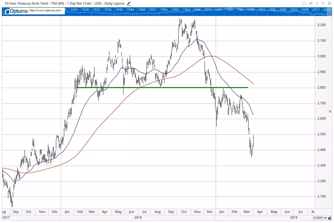
But then we have the US Bond market, again the world’s biggest. You’ve read enough already about the inversion, this should not be new news. The chart below shows the benchmark 10 year US Treasury note yield courtesy of one of our favourite market analysts, Greg Canavan of Crisis & Opportunity.
As Greg says:
“Yields are down sharply in 2019. That’s the bond market pricing in weaker economic growth. Bonds are saying we’ve seen the best of the business cycle. That means company earnings growth is likely to come under pressure.”
He then goes on to talk to the 3rd of the world’s biggest asset markets; the US dollar.
“The other point to note is the continuing strength of the US dollar. When global monetary conditions are loose, the US dollar is usually weak. And while there is little doubt that global monetary conditions are indeed loose right now, it is perhaps a warning sign that the US dollar isn’t playing along.”
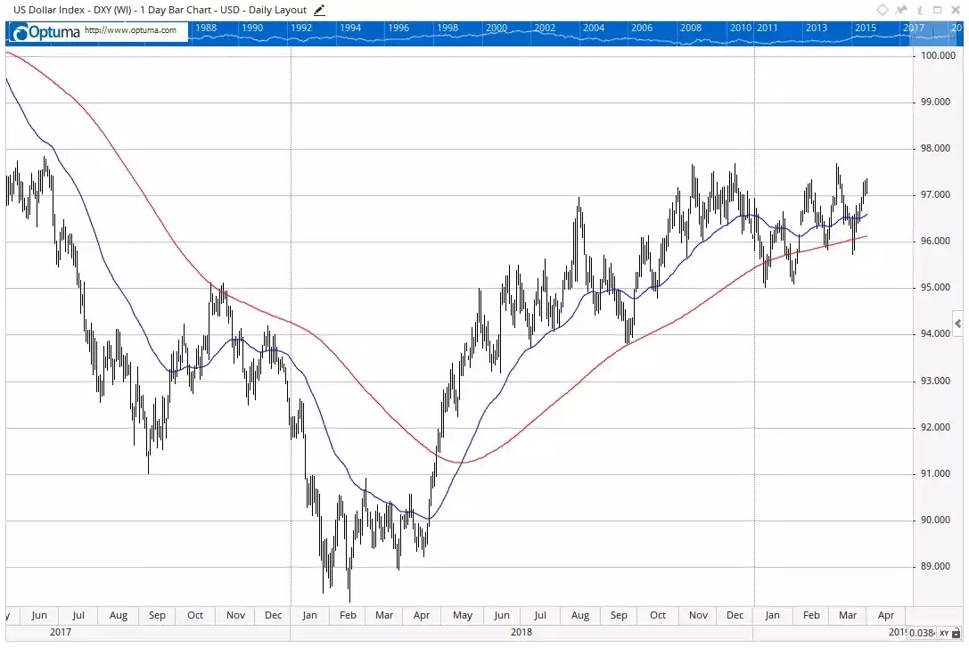
“That may change in the weeks ahead. But the resilience of the dollar in the face of the Fed’s about turn on interest rates a few weeks ago is significant.
I’ve highlighted these two charts because they are just about the two largest assets markets in the world. There is a huge amount of information in the charts of the US 10-year bond yield and the US dollar. And they are not saying the same thing as the US equity market.
This is why I’m sceptical of the rally, and why I think we could still be in a topping out phase.”
Gold isn’t buying this equities rally either. Despite the traditional headwinds of the USD strengthening, gold has held strong and of course is up further in AUD terms.
Greg pretty much called the action so far on the S&P500 and makes the following observations of the current set up in reference to the chart below:
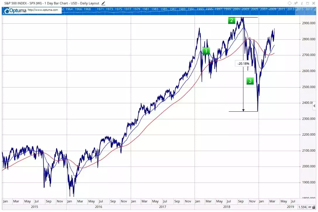
“I think probability favours the ‘market is topping out’ view, like it did mid-way through 2018.
I say ‘probability’ deliberately. There are no ‘definites’ when it comes to the market. There are only probabilities.
And I say that probability favours a ‘topping out’ view because, throughout stock market history, plenty of topping out patterns have played out like you see in the chart above.
That is, you see a peak, a correction, and a rally back close to the peak before prices turn down again.
What makes this period unique is the time it is taking. The market went vertical in late 2017 and peaked and crashed in early 2018. It then consolidated and rallied into another peak in early October 2018. Then you saw another crash, and now the rally again.
In other words, this has been more than 12 months in the making. That is unusual. It reflects the highly interventionist monetary policy we have to deal with these days.
The late 2018 mini-crash was a result of fears that higher interest rates would hurt the market and economy. The 2019 recovery rally is a result of that fear unwinding…..But here’s the point: The rally is all about monetary policy, and nothing to do with genuine economic recovery.”
Something we’ve been writing about repeatedly. If a sharemarket is rallying because the US Fed thinks the economy is so bad it needs to pause on raising rates and unwinding its previous QE accrued balance sheet, you really have to ask yourself how sustainable that really is.