What “Fake” NFP Means to Aussies
News
|
Posted 05/06/2017
|
8645
As we wrote last week, there was a lot riding on the US employment figures released Friday night, and it wasn’t what the Fed had hoped for… it was a shocker. But as usual it wasn’t the headline (which was bad enough) but the detail beneath it. Why does this matter to Aussies? Because the Fed know they need to normalise rates and seem hell bent on doing so. History is littered with examples of recessions being caused by central banks tightening policy (raising rates) into a fundamentally weak economy. A US recession normally sees the world follow suit. Last time, the GFC, Australia avoided a technical recession but any scan of the press over the weekend reveals growing ‘expert’ calls for us heading for one now regardless (we wrote about this last week here and here). A US recession would just seal that fate.
So what happened Friday night? The headline non farm payrolls numbers saw a big miss with only 138,000 new jobs (185K expected, 140K lowest estimate) and both March and April’s numbers quietly revised down by a collective 66,000. The continuing concerns on wage growth took another hit with a miss at just 0.2% for average hourly earnings due to a majority of the new jobs being in the ‘minimum wage’ categories. The unemployment rate dropped to 4.3% but did so on the back of the participation rate dropping again to just 62.7% on the back of 608,000 more people dropping out of the ‘labour force’. To quote a Jim Rickards tweet:
“Here's a thought experiment. 320 million are home watching TV. One person is looking for a job, finds it. "Unemployment" is now 0.0%. Good?”
In a continuation of the trend we are seeing here in Australia, full time jobs are declining in lieu of part time jobs. The accompanying household survey showed a decline of 233,000 employed workers courtesy of 367,000 full time jobs lost against 133,000 part time gained.
The aforementioned article last week questioning the validity of these numbers was further reinforced by a Morningside Hill report that looked into the influence of double or triple counting part time jobs and the business birth / death model on the figures. We’ve spoken to the latter before, it is the BLS’s way of estimating the move from people previously employed to starting their own new businesses (birth) and the ‘death’ of those that fail. The ‘science’ behind it is questionable to the extreme but its influence (of course to the positive) is enormous. How big? Have a read of the conclusion of that report….
“There has been an ongoing macroeconomic debate on the BLS’s job numbers and why they are at odds with so many economic indicators. After presenting the evidence on new business formation dynamics, we believe this table merits another look.
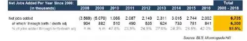
We won’t call the jobs added through the birth and death model fictional, but they can be described as hypothetical, unaudited data, with no support from actual business birth / death statistics.
Beyond the birth and death model, no one knows how many of the BLS jobs were double and triple counted part-time positions. According to some studies (Harvard-Princeton, etc.) most of the jobs added after 2005 were indeed part-time jobs. Therefore if, according to official numbers, we added a net 6.7 million jobs over the past 9 years and most were part-time jobs, while the birth and death model added 6.3 million of these jobs, this means that the actual number of full-time jobs has declined significantly. By this measure the jobs market has never recovered from the 2008 recession. In this case, US workers have every right to be discontented. This may explain why so many of them voted for Trump and his ‘bring back the jobs’ platform.
The NFP jobs and the initial jobless claims reports are flawed indicators. If tomorrow General Motors lays off 1,000 full-time workers and they end up working two part-time jobs each, the BLS will report a net gain of 1,000 jobs. If, further down the line, those same workers lose their part-time jobs, they will not be eligible for unemployment insurance and will not show up in the initial jobless claims report.
Fretting over whether the next jobs number will be 160,000 or 211,000 adds little value to any fundamental analysis.”
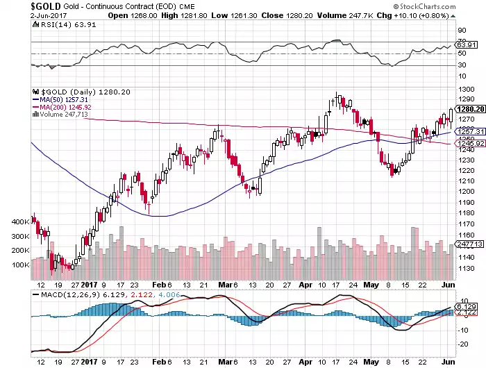
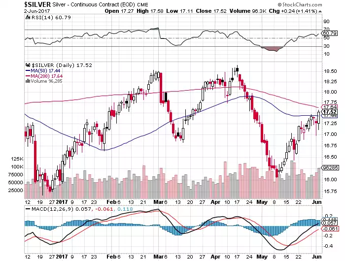
You will have noted both gold and silver jumped strongly on the release of the NFP Friday night our time. The question of why is interesting. On the face of it, it is because the figures add to the numerous poor economic data prints of late and are counter to the Fed’s ‘everything’s awesome’ narrative, meaning they won’t raise rates and the cheap money game continues (which is why shares also bounced). But gold and silver have actually rallied on each of the last 3 rate rises so that seems a little counterintuitive? Maybe those subsequent rallies are because the market is expecting one of these tightening moves in a fundamentally weak economy will be the straw on this heavily debt burdened camel’s back? The charts below show gold consolidating its break, and silver commencing it’s break, through their key respective moving averages. It will be interesting indeed to see what happens after the Fed meeting next Wednesday our time….