The Truth Behind “Highest Household Wealth”
News
|
Posted 23/09/2020
|
16576
In a world where news often comes in small byte headlines one could be deceived into thinking things are better than they are without a little critical thought or at least a deeper dive in to the story. Case in point “US Household Wealth Hits Record High” that we saw yesterday. Talk about a V shaped recovery! But..
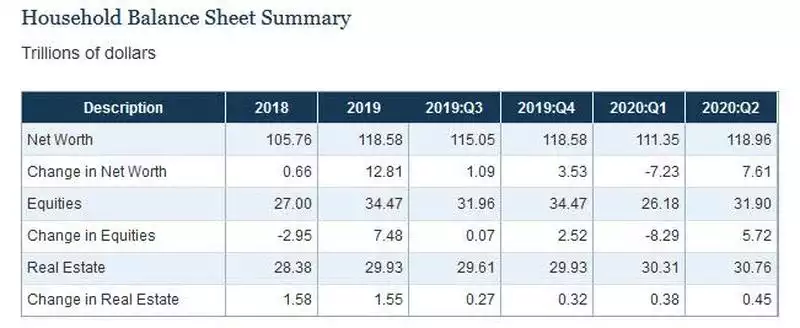
The US Fed’s Flow of Funds report showed that, after the biggest drop in household wealth last quarter of $8 trillion, we saw in this last quarter the biggest increase in history, an almost full rebound of $7.6 trillion.
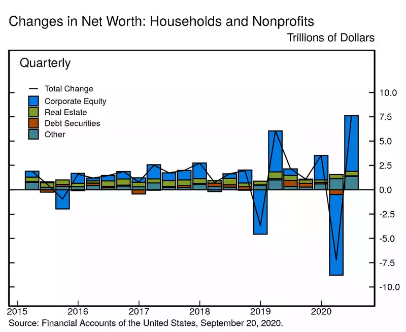
A quick glance at the chart above tells you where all that change in ‘wealth’ came from… shares.
And therein lies the unfortunate truth and also one of the key determinants of how this next US election pans out in the immediate term, how doggedly Trump will keep ‘his’ stock market high, but more broadly how social inequality and dislocation is getting worse.
That US household wealth sky rockets at a times when literally 10’s of millions of its citizens have either lost their jobs or have reduced incomes is very telling. There are over 29 million Americans getting unemployment benefits. Most of those were from already lower paying jobs hit hardest by the pandemic. Indeed research from Opportunity Insights revealed the highest paying 1/3 of jobs have almost fully recovered whilst the bottom 1/3 are 16% lower. And that’s just for those who still have one…
The Fed data also reveals that the wealthiest 1% own 31% of the entire US’s wealth, top 10% more than 2/3 of all wealth. You can do the math, but that means the ‘rest’, 90% of all Americans, share less than 1/3 of all wealth. Last election that saw a lot of red Make America Great Again hats in protest of a government that could let that happen. Whether that plays out again or if they see the prospect of more direct free money from the Left remains to be seen.
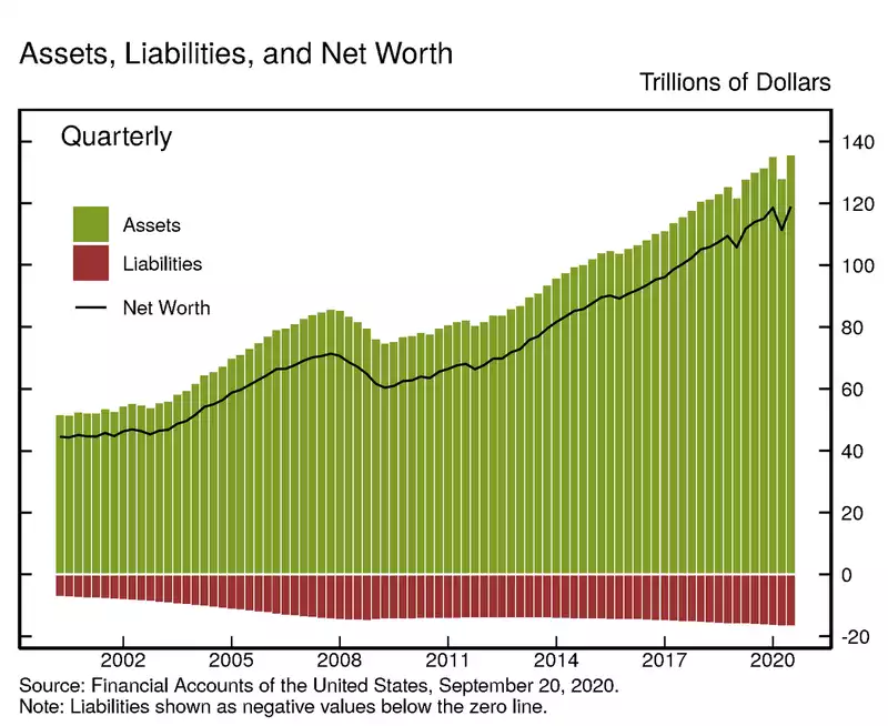
The above chart shows the changes and below are the totals. You can see that the biggest change in history also delivered the biggest amount of household wealth in history, albeit not inflation adjusted.
Breaking that up by category you can see that equities are again the biggest source of wealth in the US, just above real estate.
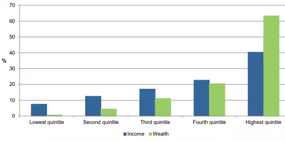
For comparison, in Australia the last report done by the ABS was for 2017-2018 where we saw the top 1% own 16% of the nation’s wealth, the top 10% own 50% and the bottom 40% own just 2.8% of the entire nation’s household wealth.
Coming back to the US, we have seen enormous gains on Wall St since the GFC, fuelled by easy money policies and stimulus from the Fed that promote more debt to be taken on to buy equities and property assets, driving those values ever higher. The reality is only the rich can get access to such debt and hence the growing divide. Wall St has boomed whilst Main St has been left behind.
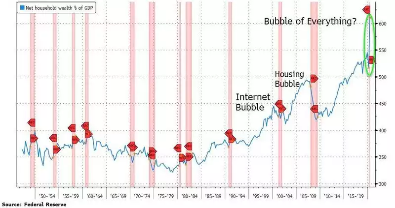
History is littered with examples of how badly that inevitably ends. That same history shows gold as the pre-eminent asset that survives and indeed thrives. That is the macro, generational view. More immediately the following chart (and the volatility of the last week) shows how this might more immediately end… Each vertical red bar is a recession. If you think the skinny little red bar on the right is over… well, good luck.