THE ONCE IN A LIFETIME GOLD TRADE
News
|
Posted 20/11/2013
|
4659
Filed in Precious Metals by SRSrocco on November 19, 2013
The conditions in the market are setting up for a once in a lifetime gold trade. Most of the participants don’t know it because they have their face and eyes firmly placed up against the television screen called the MSM — Main Stream Media.
As they focus on the manipulated information and schizophrenic Fed press releases, there’s another show taking place on a different channel very few are aware. It’s called GOLD:Hidden Secrets of Money. Yes, this is the video series that Mike Maloney and the folks at GoldSilver.com put together.
It is probably one of the best video series describing the fraudulent fiat monetary system run by the Federal Reserve that has siphoned and stolen wealth from Americans as well as citizens throughout the world. Currently the ranking of this gold show on the air waves is very low, but that will change in the future.
You know we are in trouble when David Stockman, Former Dir. of the US Management and Budget interviewed on King World News this weekend, said the following on what he thought of the Janet Yellen Fed Chairman Nominee Senate hearing:
“Frankly, I thought it was appalling. Kind of a petty fogery of a Keynesian schoolmarm that was superficial, mechanical, naive and disingenuous.”
Stockman goes on to say Yellen’s answer (from one of the members at the hearing) that the Fed was not monetizing the debt, but rather carrying out the directions of Congress was simply, “Absurd” I highly recommend the KWN Stockman Interview if you have not heard it already.
This is where we are heading… into the end game of the fiat monetary system as the official policy and policymakers become even more bazaar, idiotic and deranged.
The Dow Heads Towards the Heavens as The Fed Flushes Gold Down the Toilet
With a great deal of QE monetization, hot air and full faith of the Fed and MSM, the Dow Jones Index hit a record new high surpassing the 16,000 level. Traders and Wall Street applauded as the Dow reached one of the largest overextended topping patterns in quite a while.
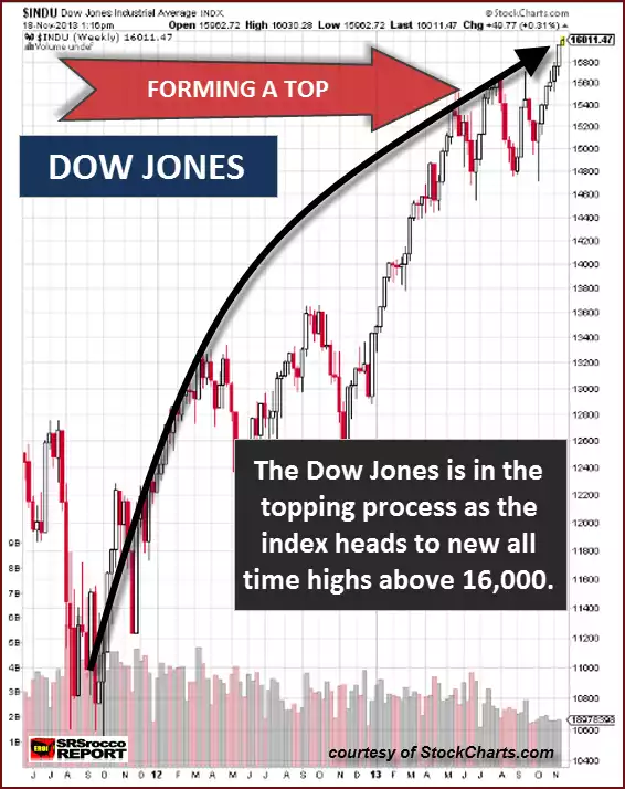
As we can see, the Dow Jones has moved from the 10,600 level back in September of 2011 to 16,000 in a little over two years — an amazing 51% move. This wasn’t a one-way street as the index sold off briefly after the QE 3 announcement.
However, with a little help from our friends at the Fed and their member banks, we had a nice turn-around and haven’t looked back ever since. The Dow has gained a cool 29% in just the past year.
On the other hand, gold was treated with the kind of monetary respect the folks at the Federal Reserve are known to show towards the yellow metal — contempt, disgust and belittlement. In the same period the Dow increased 51% (Sep 2011 – Nov 2013), gold lost 33% of its value.
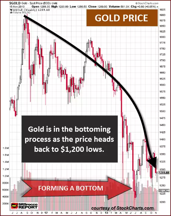
Some will say that gold was over-bought back in September 2011 when it reached $1,900. While this may be true if technical analysis is used in charting a manipulated market, the fundamentals could have pushed gold up to much higher valuations. Unfortunately, the fundamentals are still meaningless in a market that is totally controlled and run by the Fed.
Okay, let’s just give into the technical traders who still adhere to a system that died years ago and agree that gold was over-bought at $1900. If we look at the two charts above, you will notice a very interesting trend. After the QE3 announcement in September 2012, the Dow headed south, and gold moved north. But, something strange occurred a month or so later in October… the trends reversed.
The price of gold at this time went from $1,775 to $1,275, where it sits today. That’s a 28% decline in gold at the very same time the Dow moved up 29%. This can be clearly seen in the chart below:
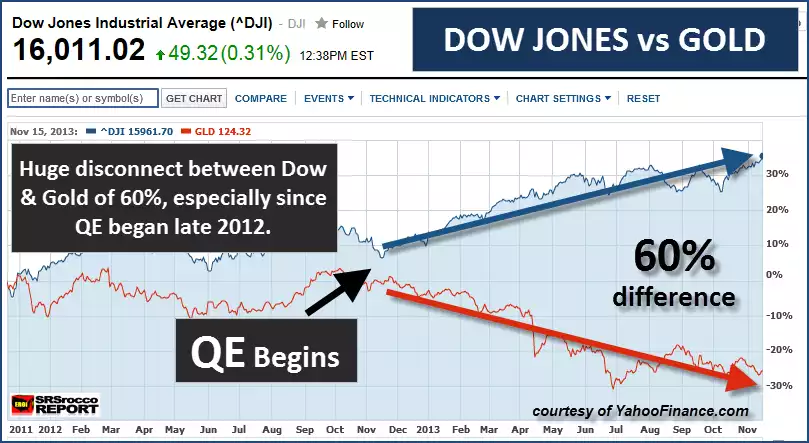
Of course, the charts I am presenting and the information I am writing about is nothing new. However, it’s helpful to review the data and look at it from several perspectives. What we are seeing in the charts here is a huge TOPPING of the DOW and a BOTTOMING of GOLD.
While I am not a technical analyst, I do see some merit in trends. I like to follow trends. If I see I am eating too much and gaining weight, I like to reverse that trend and let it ride in the opposite direction. I am not always successful reversing this trend, but at least I know where the TOPS & BOTTOMS of my weight limit trends are located.
Folks let’s face it, the Dow is becoming extremely expensive. Sure, it’s possible the Dow Jones can continue to increase for a while, but the reward vs. risk is becoming less each day as the index bloats to higher levels.
According to a Zerhodge article, Jeremy Grantham’s GMO stated the following as it pertained to the overvaluation of the S&P 500:
To wit “the U.S. stock market is trading at levels that do not seem capable of supporting the type of returns that investors have gotten used to receiving from equities.
…Combining the current P/E of over 19 for the S&P 500 and a return on sales about 42% over the historical average, we would get an estimate that the S&P 500 is approximately 75% overvalued.”
Full Article Here
As the valuations of the broader stock markets move further into bubble territory, the price of gold is falling closer to its cost of production.
While I realize there are some analysts who would certainly say, “The price of gold is not derived by its production cost, but rather its supply and demand forces”, my reply would be, “if anyone is still paying attention to those forecasts, you need to check yourself into the nearest MRI clinic and get a brain scan.”
We must remember, Bear Stearns and Lehman Brothers went belly up virtually overnight. You could say the technical analysis of the supply and demand forces of these companies share prices went from a relatively HIGH DEMAND to NOTHING in a very short period of time.
That’s how I see it taking place in the gold market — one minute you got some clown pointing to a gold surplus chart and the next moment there isn’t a physical ounce of gold to be found anywhere at any fiat dollar price.
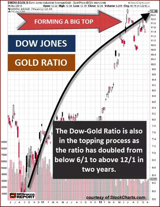
The Dow-Gold Ratio Should Wake Up the Dead
There’s not much that gets me excited today. After researching the details of the coming dire global energy situation, everything else seems quite trivial. However, this chart should help wake the living dead.
I don’t know how many people watched the comedy, “Monty Python and the Holy Grail” (during the time of King Arthur), but there was this scene where these guys pulling a cart went around yelling “Bring Out Your Dead.” The scene takes place during the Plaque and these ghastly characters were going around collecting all the dead in the town.
Now I know it sounds a bit morbid, but for some odd reason… this Dow-Gold ratio chart made me think of it. Instead, I look at it as “Waking up the Dead.” Here we can see that this Dow-Gold Ratio chart is also forming a TOPPING pattern. In just a little more than two years the Dow-Gold ratio has doubled from 6/1 to 12/1.
Even though the ratio could still increase, the trend is asking for a reversal at some point in time. If investors can’t see the GOLD TRADE OF A LIFETIME being set up right in front of their eyes, then they might as well lay down and wait for the Monty Python cart to come pick them up.
Investors need to realize that when the Fed can no longer prop up the stock indexes, bond markets, and the overall economic system, we will have an implosion of paper assets and explosion in the value of gold (and silver). Once this trade takes place, it won’t happen again.
Regardless, we are presently sitting at two market extremes…. a bloated blue chip stock index that moves higher from the very QE gas emanating from the Fed, while gold has been pushed down like a huge balloon underwater. At some point in time, the popping of one will release force of the other.
Very few know it… but the Once in a lifetime Gold Trade is being set up right now.