Debt, Inequality & Social Revolt
News
|
Posted 04/09/2017
|
6363
Gold continued its upward trajectory Friday night thanks to an awful jobs report out of the US (and at the time of writing is taking off again on North Korean tensions growing, up $15 on the open this morning).
The monthly non-farm payrolls report for August was a shocker, hitting just 156,000 new jobs against expectations of 180,000 and also another quiet revision of June and July down by another 41,000. The unemployment rate rose to 4.4% and, importantly, average weekly earnings declined, taking the year-on-year rate to the lowest since the beginning of the year at just 2.2% (though still higher than Australia’s….). The number of Americans not in the labour force increased by another 128,000 to 94.785 million people.
Shares actually went up on the news because bad news is good news when it comes to the main thing driving today’s sharemarket… debt. So bad was the report, and combined with hurricane Harvey, few now expect the Fed to raise rates this year. The free money game continues… It is this point and that declining wage growth that may be at the heart of what sees this epic credit cycle come to an end. You can’t enrich the few and leave the rest behind and expect social harmony. We have written often of the social impacts of QE and zero interest rates. But this is not solely a post GFC problem, it is a credit expansion problem that started way earlier. Indeed the GFC was just a reality check of what happens with too much debt. The next will be far far worse.
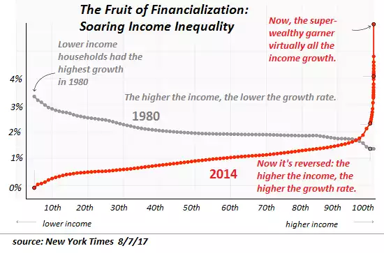
The charts below clearly show how this has played out over the last 40 years. It’s probably ‘coincidence’ but remember when looking at the first chart that we left the discipline of the gold standard in 1973… Since then governments could create fiat money out of thin air through debt…
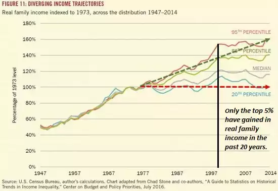
You can see it starts to really diverge from around 1980 and the graph below compares 1980 wealth growth (as a percentage) across the percentile range of income. It is reasonably weighted with lower incomes gaining more as a percentage than the top earners (remembering a higher percentage of a smaller number is still a small number). You then look at 2014 where the vast majority of growth is in that very top 1%. These are the people who hold the majority of the financial assets and jobs that have been inflated by the expansion of debt. The GFC saw ‘mums and dads’ try to enjoy this through getting subprime loans, growing house values, and redrawing off the same subprime loans. It didn’t end too well for them but Wall Street seemed to come out just fine thanks very much….
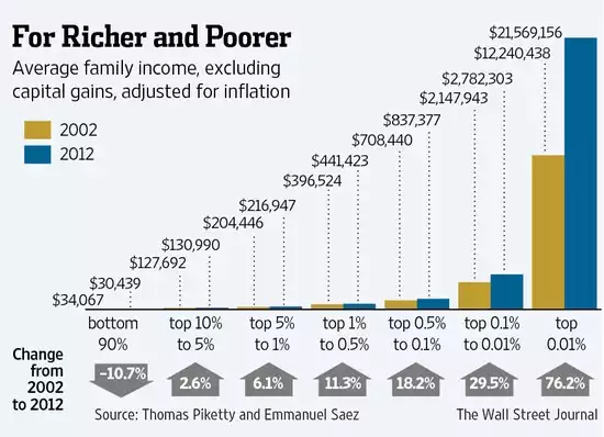
The graph below puts it in even clearer terms where you see the top 0.01%’s income up 76.2% in the decade to 2012, whilst the bottom 90% dropped 10.7%. Critically too, this chart excludes capital gains, where again it is the top percentile that own most of the assets that have been wildly inflated by all the monetary expansion.
Please don’t underestimate the importance of this phenomenon. Credit cycles end badly not just because the debt ends up too burdensome for the weak underlying economy, but the social divide and ensuing revolt make it unsustainable too. Brexit, Trump, etc are but tiny examples of what happens when the 90% voice their dismay. Suppressing rates for longer and throwing more debt to fix it, as will be the result of Friday night’s jobs report, will only make it worse… ironically for the very reason the report was so bad. The gold price can see what’s coming….