7 Super Bullish Charts for Gold and Silver
News
|
Posted 11/05/2022
|
13183
Less words more charts today as we hit some very interesting junctures in precious metals markets.
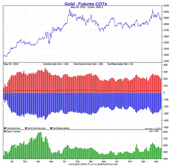
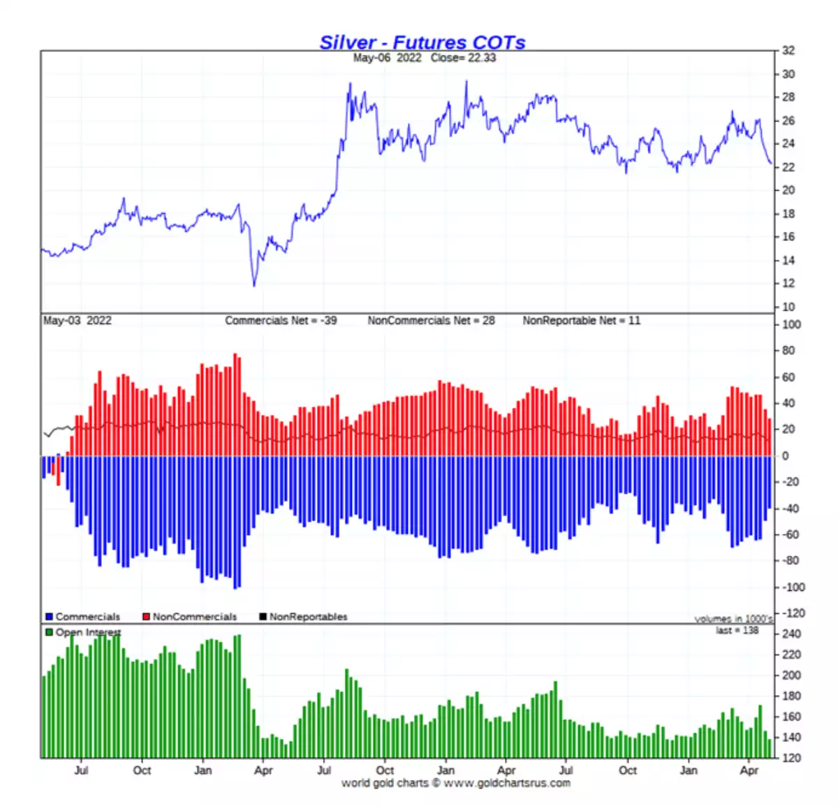
First the chart with an almost 100% track record of success is the Commitment of Traders report on COMEX showing the positions of the big traders. Every time non commercials (dominated by the speculative managed money) are this least long and the big commercials (bullion banks etc) on the other side are this least short, we see the price shoot up as that inevitably reverses. Note we are not saying this is the bottom but it either is or looks close on an historical basis:
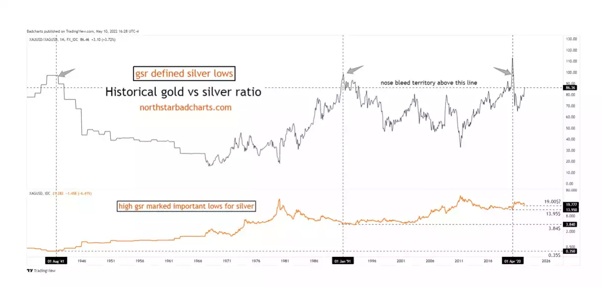
Next, that trusty barometer of the Gold Silver Ratio, unsurprisingly after silver’s awful couple of weeks is up at high highs of 86 again. As the chart (courtesy of Badcharts) below illustrates that is predictably a point of imminent reversal that ordinarily sees BOTH gold and silver prices rise but silver outperforming as mean reversion plays out:
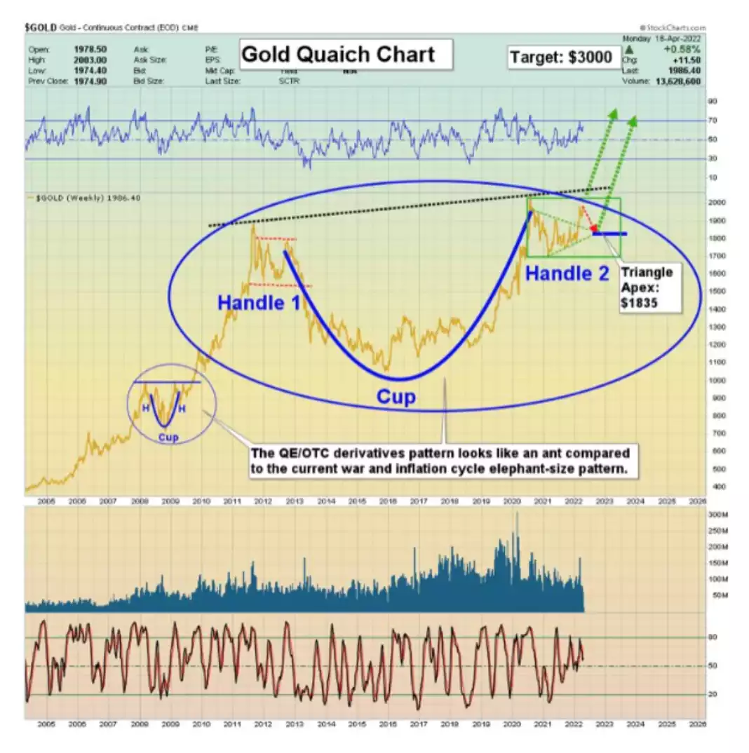
And finally we have that most epic of all cup and handle (quaich) technical formations in both metals that portend very major price breakouts to come.
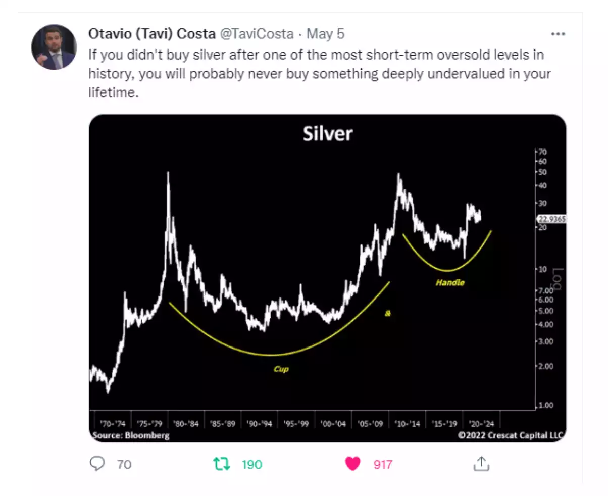
And as we shared last week a similar set up for silver:
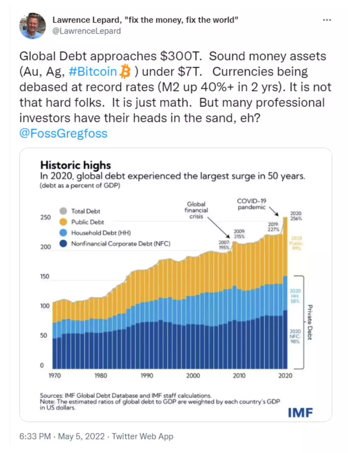
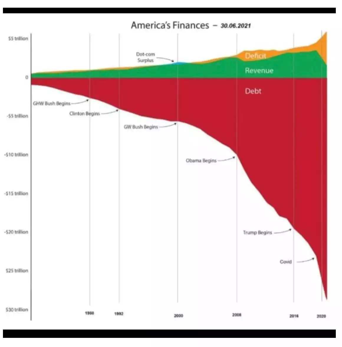
Of course charts aren’t always predictors of future events. What we can look at on the factual basis of past events is how we got here at all and then look at the above in that context whilst listening to your gut about where this must surely end…
