These 3 Graphs Scream ‘Sell Shares Now’
News
|
Posted 09/05/2016
|
6363
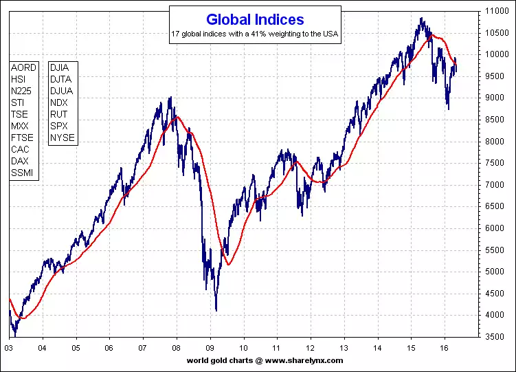
On Friday we presented graphs showing the deployment of record corporate debt into buying back shares and hence artificially inflating share prices. We finished Thursday’s article mentioning the S&P500 had recently formed its second ‘lower high’, something that normally precedes big losses ahead. To show that was not just a US-centric phenomenon this chart (across all major global indices) shows the same:
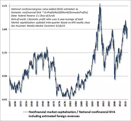
In early December last year we presented the analysis of John Hussman and it’s due an update given this topic. Please read the link for a recap of how this is done and the incredible historic correlation. When you look at the first graph you will see that previous visits to the current range resulted in the six crashes of 1901, 1906, 1929, 1937, 2000 and 2007. Those crashes saw falls of between 45% and 89%.
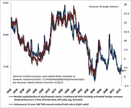
The next chart (again, explained in December) illustrates the expectation that US shares would return around 2% per annum for the next 12 years.
When one considers the 3 charts above together it would be a completely logical conclusion that right now we are potentially in the late warning signs of an imminent crash. That crash historically would see you lose 45-89% of your wealth (though most are predicting the next one to be unprecedentedly big). Now you don’t ‘lose’ until you sell, but it would take 12 years to get back to just a 2% return… less than inflation. Alternatively you could get out of shares now, buy safe haven assets such as gold and silver and maybe some cash, and buy shares again at the bottom, after the crash, and with something that normally goes up while the shares have been going down. As a final reminder of that last point… in our last crash (GFC), shares halved and gold doubled over that period.
It is any coincidence that Managed Money long gold contracts just hit a 5 year high on COMEX?