The Margin Call Spiral
News
|
Posted 18/10/2018
|
8987
Mike Maloney has earned a loyal following from explaining financial conditions simply and relevantly. From time to time we have shared the chart of margin debt against the NY Stock Exchange. Not surprisingly it is again at all time highs. Just as gold is still relatively low, confidence and ‘irrational exuberance’ are at highs, albeit with nervousness now in play after late last week and again last night. Such exuberance too often creates a blind spot to risk and so, hey, let’s borrow more and go “all in”… Mike’s latest video (link below) goes for just 8 minutes but let’s give you a summary if you don’t have the chance.
Mike has developed what he calls his Market Fragility Index.
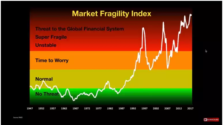
He calculates this by multiplying the so called ‘Buffet Index’ being the percentage of the value of the entire US sharemarket versus the entire US economy; by the ratio of Margin Debt against the value of the entire US sharemarket. Individually they look like this:
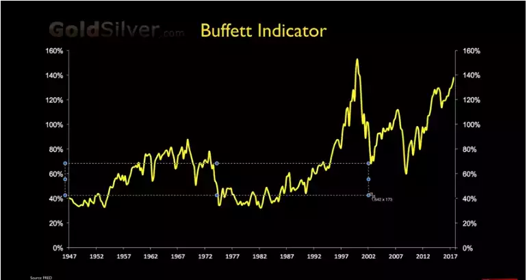
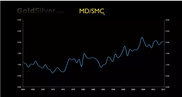
As you can see the Buffet Indicator has only been higher in the dot.com bubble and the margin debt v sharemarket cap higher than then and approaching pre GFC levels.
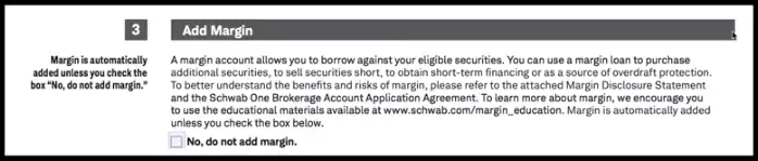
What has Mike particularly concerned was an unsolicited change he noticed to his brokering account where he now had to opt OUT of having margin debt! Talk about leading the lambs to the slaughter…
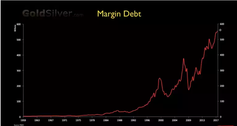
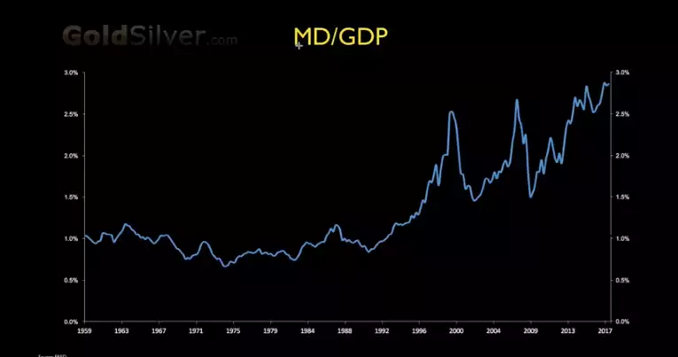
Just remember margin debt means you can borrow to buy more shares but if the shares drop by a certain amount you need to top up your account to pay that margin call. If you can’t they come after your assets. Margin debt in effect works like the reverse of a short squeeze where people have to liquidate to cover their margin call, and so exacerbating the very same fall in prices that precipitated that initial call, and often triggering another, and so the spiral down goes… The following charts show the record high margin debt right now both outright and then against real output (GDP) as opposed to the above chart that has it against inflated sharemarket prices…
When considering the above charts just remember price is what you pay, value is what you get…. Mr Buffet famously said that and hence why his chart divides market cap by economic output and is currently at its second highest level outside of the ridiculous mania that was the dot.com bubble. You can watch Mike Maloney’s video here.