Silver Scrap Supply 26yr Low
News
|
Posted 01/05/2018
|
7600
Many are aware that recycling is quite a large component of overall gold supply, particularly when prices are high. We’ve all seen the ‘gold buyers’ pop up in shopping malls in such times and then disappear when fervour subsides. Indeed gold scrap recycling accounts for around 28% of global gold supply, and nearly 90% of that from jewellery. That means the supply part of the supply/demand/price equation has a very large discretionary component. i.e. you don’t sell grandmas old jewellery when the price is low and therefore don’t put more pressure on the price in such times.
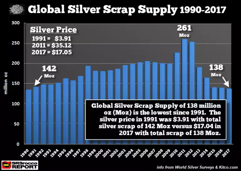
Few however realise the silver recycling market is quite different. Silver scrap only accounts for around 14% of global supply and in 2017 it hit a 26 year low when the price of silver was just under $4. The chart below (in USD) shows the action over those 26 years and you can see the discretionary action in play again in 2011 when scrap supply was almost double 2017 levels.
Rather than being dominated by one sector like gold, silver scrap supply is more spread out. A report in 2015 estimated the following breakup:
Industry = 60%
Silverware = 16%
Photographic = 12%
Jewellery = 10%
Coin = 2%
There are a few obvious standouts above. Firstly, like jewellery, silverware is very discretionary. You’re less likely to sell that silver cutlery now at $22 than you were at $50 in 2011 and the chart reflects that. Secondly, before the digital age a big consumer of silver was photographics. We’ve seen a whopping 80% decline in photographic uses since 1999 (from 228m oz to just 44m oz last year) and a corresponding drop in recycling of course.
However the big difference between gold and silver is silver’s huge industrial demand. Whilst photographics has died, it has been more than replaced by uses making the most of silvers unparalleled conductivity, reflectivity, and microbial resistance. Half of all silver produced is used in industry. A lot of that is in uses that see it discarded, not recovered, and particularly at these prices.
That the chart above shows quite clearly the decline in recycling (and we have written previously on mine supply pressures) makes the supply/demand/price equation look all the more enticing