Shooting Out of Control
News
|
Posted 02/02/2016
|
4604
Yesterday we included a chart of the growth in negative yielding bonds in the world and mentioned it as yet another ‘parabolic’ economic chart.
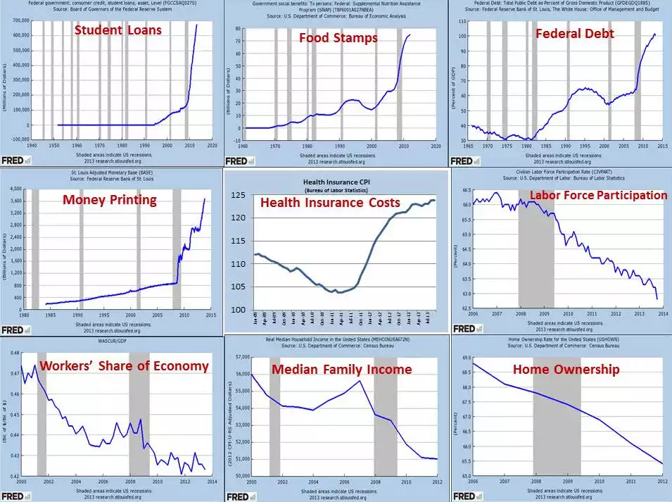
So what of these other parabolic / exponential / skyrocketing charts? The collection below has been doing the rounds and if you’ve missed them they paint a pretty clear picture – your ‘gut feel’ barometer should be warning of storms ahead. It’s US centric and politically motivated but a) the US is supposedly the new global economic saviour, and b) it’s typical of the world as a whole. It’s a bit hard to read but just know that the vertical grey shaded bars mark recessions. That last big one of course was the GFC. In short it paints a clear picture of rampant money printing and debt accumulation in a reflation effort post GFC. But it’s not working. US Durable Goods Orders were abysmal on Friday – a clear sign of a weak economy. Wall Steet boomed Friday night our time as that combined with Japan’s easing had the traders convinced more easing from the Fed is coming (Australia rallied yesterday on the same). The charts below show that stimulus might be great for Wall Street (for now) but it’s not working for Main Street and that will eventually see the whole thing come crashing down.