One Chart – Why The Fed Is Stuck
News
|
Posted 21/09/2016
|
4688
The world is on tenterhooks on the eve of the US Fed announcing whether or not they will raise US interest rates by a measly 0.25%. There are many reasons why such a small increase could cause market carnage but in its very simplest form the following graph speaks volumes:
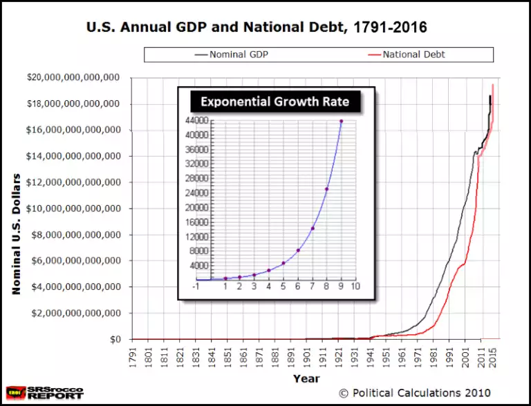
We discussed this most recently last week, but more fundamentally in August on the 45th anniversary of this epic credit cycle, and you can see oh so clearly where things go (beyond) parabolic from 1971 in the graph above. GDP will continue to be the ‘benchmark’ for prosperity, but as we continue to point out, you can ‘buy’ GDP with debt. The problem, as it is at the end of each credit cycle, is when that debt overwhelms.
There is no easy way out of this, it just comes down to when ‘they’ are prepared to take the medicine. The odds are low on a rate rise tonight but some big names warned yesterday that you should not be surprised if the Fed do indeed take that medicine tonight. We continue to think they won’t do it before the election and you could see both shares and gold soar tonight. If they do you can expect to see gold and shares take a very big hit. The problem, as the chart above highlights, is that the system will struggle with higher rates and it could be the ‘prick of the bubble’ that sees the whole thing unwind. The GFC may have been a minor preview… shares halved and gold rebounded after that initial dip to go on to double.