Long Term Golden Cross Just Happened
News
|
Posted 13/02/2017
|
6971
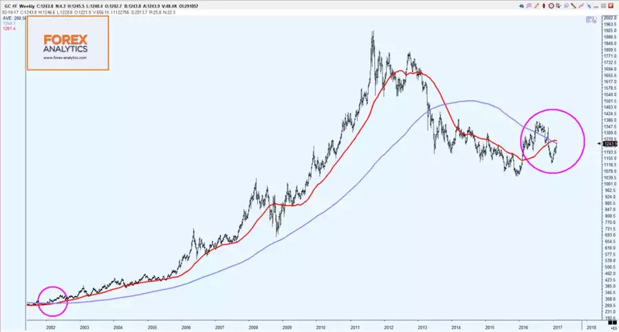
On Friday we showed you a chart comparing previous bull market runs in gold and, if indeed we are in the early stages of a bull run that started in December 2015, where we sit now. The question for some, given the scale of the correction late last year, is ‘are we still in a bull market?’.
To help you decide, it may be instructive to look at long term moving averages in the gold price. Whilst last year we saw a golden cross of the 50 day moving average breaking up through the 200 day moving average seeing gold go on to surge to US$1365, daily averages are arguably a little too ‘zoomed in’ to rely on longer term trends. That is why something that happened just recently should be taken notice of…. We had a longer term golden cross with the 50 Week MA (red line below) breaking up through the 200 Week MA. This is something that has only happened 4 times in the last 25 years and each time saw a 3 to 10 year rally in gold, with the last as pictured below seeing gold go from $290 to an all time record high of $1923, a 563% increase.
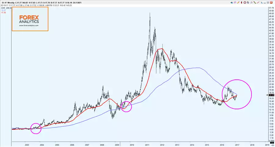
And again as discussed on Friday, silver has a habit of lagging gold (high gold silver ratio – currently 69) and then sling-shotting past gold once the gold price starts to take off (hitting 30:1 at the peak in 2011 above). Looking at the same chart for silver below you can see this starting to play out but you can also see silver is the more volatile of the 2 being a smaller market with the dual forces of investment and industrial demand:
Again we have to stress that historic performance is not necessarily an indicator of future performance but there are a number of historic ‘coincidences’ painting a pretty compelling picture right now….