Gold, Silver, World Shares since 2000
News
|
Posted 23/06/2017
|
6558
On Tuesday
we shared a fascinating ‘quilt work’ of returns of a host of financial assets since 2000. A few people have asked where Aussie shares and silver fit in that mix, so let’s break it down a little.
First let’s look at a range of global indices over this period:

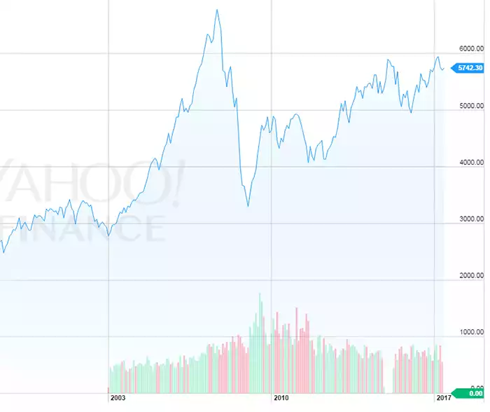
The standout is India’s BSE Senex which has seen a 482%, the worst the French who are still negative 10% and the biggest index, the S&P500 is up 68.6%. Again little old Australia is not included but the All Ords has seen an 83% increase since the turn of the century though is still over 1000 points or 16% below its pre GFC high.
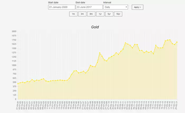
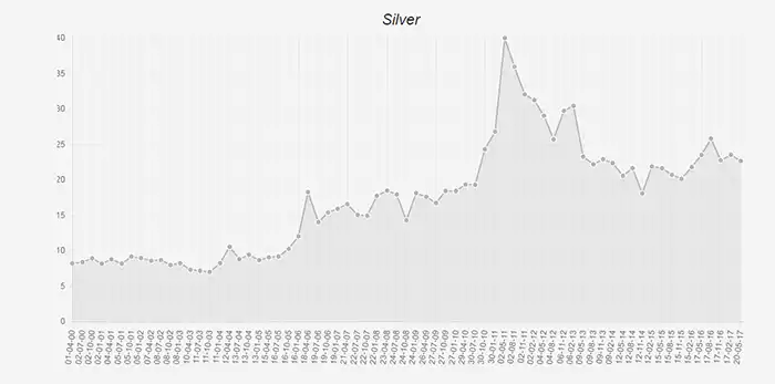
Using our Ainslie charting tool we see Gold up 268% and Silver up 176% (387% at its 2011 peak!) over the same period:
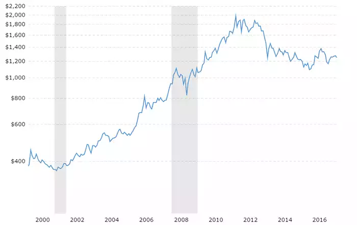
The above are in Aussie dollars and only tell part of the story. Gold saw its USD spot price bottom of $360 in April 2001. It then rallied to $1971 in August 2011, a 448% gain. It then entered a bear market lasting until November 2015 where it bottomed at $1051. Since then it’s maintained a slow upward trajectory that supports the ‘bottom is in’ thesis. In amongst all this our AUD has smoothed things out somewhat. As you can see we are at an all time high now, not 2011. The potential remains then that we could see the double whammy of a rising US spot price together with a falling AUD adding impetus to those rises. In terms of silver, well we remind you the scenario just outlined is starting with a Gold/Silver Ratio of nose-bleed 75. The mind boggles should that revert to the mean in this cycle….