Gold sentiment v profit improving
News
|
Posted 04/05/2015
|
4356
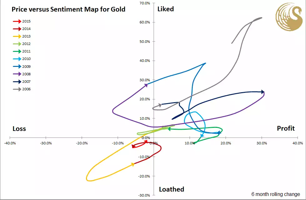
Here’s a graph you don’t see every day. Bron Suchecki heads up research at Perth Mint and put together the following plot of sentiment versus profitability. For each month over the past 10 years the map plots a point for the percentage return on gold (over the prior 6 months) and the percentage change in ounces held (over the prior 6 months), the latter to replicate sentiment (i.e. people are sellers when they loath and buyers when they like). The monthly plot points are then joined into a line for each year. He then places an arrow on December of each year to give an indication of the direction of movement over time. You will note it appears to indicate we are heading out of what he calls the “sad corner” into the “happy corner”. This graph only tells part of the story as he has used the USD spot price not AUD which, even after the pummelling last week, is still up 4% (and 7.7% for silver) year to date, so Aussies may already be in the “happy corner”. But regardless, and as we reported last week on silver, we are still relatively in the lows or at best formative stages of a turn in the market. For anyone who likes to buy low and sell high, and this graph (together with any sharemarket or property equivalent right now) reinforces the ‘sheeple’ nature of humans to do the opposite, now is certainly looking like a good entry point to start, or for existing holders, to average in.