Gold Poised for Breakout
News
|
Posted 22/11/2017
|
6751
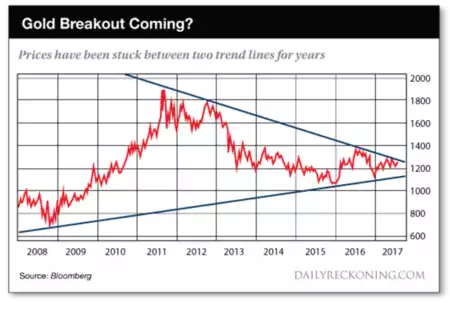
Today we look at the one chart a number of analysts are focussing on. The following is one version of it courtesy of Daily Reckoning and it illustrates clearly the gold price action we spoke of yesterday.
Jim Rickards explains what this means:
“Gold analyst Eddie Van Der Walt produced this 10-year chart for the dollar price of gold showing that gold prices have been converging into a narrow tunnel between two price trends — one trending higher and one lower — for the past six years.
This pattern has been especially pronounced since 2015. You can see gold has traded up and down in a range between $1,050 and $1,380 per ounce. The upper trend line and the lower trend line converge into a funnel.
Since gold will not remain in that funnel much longer (because it converges to a fixed price) gold will likely ‘break out’ to the upside or downside, typically with a huge move that disrupts the pattern.
At the extreme, this could imply a gold price on its way to $1,800 or $800 per ounce. Which will it be?
The evidence overwhelmingly supports the thesis that gold will break out to the upside. Central banks are determined to get more inflation and will flip to easing policies if that’s what it takes.
Geopolitical risks are piling up from North Korea, to Saudi Arabia, to the South China Sea and beyond.
The failure of the Trump agenda has put the stock market on edge and a substantial market correction may be in the cards.
Acute shortages of physical gold have also set the stage for a delivery failure or a short squeeze.
Any one of these developments is enough to send gold soaring in response to a panic or as part of a flight to quality.
The only force that could take gold lower is deflation, and that is the one thing central banks will never allow. The above chart is one of the most powerful bullish indicators I’ve ever seen.”
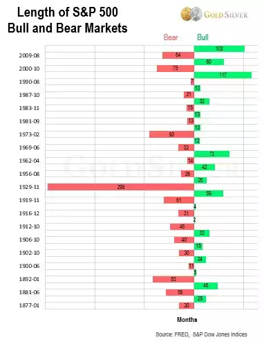
We have written extensively of late of that looming “substantial market correction” he refers to. Be it valuations, be it time, be it a ‘black swan’ event such as a bank failure, the clock is most certainly ticking on this highly strung out market. Mike Maloney produced the following chart which puts the time piece into perspective. We are getting very close to this bull market being the longest in history. Tick tock….