GLD/SPX Flags Gold Rise Ahead?
News
|
Posted 19/09/2016
|
5035
2016 has been an interesting year to say the least. We had the sharemarket crash in January and February on a mix of China devaluing the Yuan and a delayed reaction to the US rate hike in December. The feeling has been one of growing scepticism on whether the central banks have ‘got this’.
Gold and silver surged to high 20’s% and mid 40’s% driven in large part by rampant buying of GLD and SLV ETF shares and hence huge demand from the ETF’s. This demand was driven by Wall St looking for a safe home.
Things have cooled off since as shares rallied, fuelled by continuing central bank stimulus, company buy-backs and more debt. There was probably even an element of ‘if we can survive Brexit we are bullet proof’. It certainly wasn’t on fundamentals, with earnings for companies in the S&P 500 having fallen for five straight quarters, the longest such run since the GFC. And yet the S&P500 is up 6.3% for the year.
In Australia where we (at the moment) have slightly higher rates, no other monetary accommodation, and feeling the China slowdown more than most, our ASX200 is almost unchanged from 1 January.
Gold and silver on the other hand are still up 20% and 33% respectively for the year despite our higher AUD (they are up 24% and 36% in USD spot).
And hence we have such market nervousness around the next Fed rate hike. We find out this week the outcome of the much anticipated September Fed meeting (and, nearly as important for us, the Bank of Japan too) as we discussed in Friday’s Weekly Wrap.
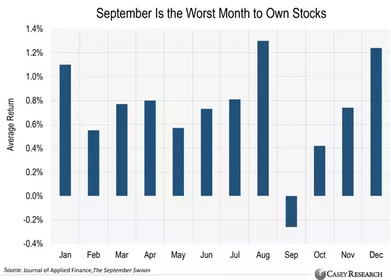
There are a couple of things to keep in mind though. Firstly September is the ‘crash month’. Many think it is October but the graph below shows September’s average is worse:
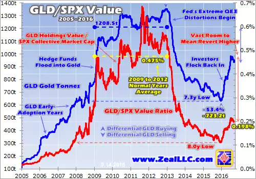
Importantly for gold, it is a reminder that despite those healthy year-to-date gains, when considered against a US sharemarket at record highs based on nothing but central bank stimulus and starving a market of ‘safe’ yield in deposits, the ratio of GLD/S&P500 (see graph below) is still relatively low. You will see the little rest it has had of late, but when, not if, the US shares take a dive you could well see a repeat of January and February, and more. The blue line is the amount of gold held in GLD, and you can see the big amounts bought early this year. The red line is the ratio of GLD value to the total market cap of the S&P500 and you can see how far it has moved away from the blue line despite that gold price increase. Just look at what happened in the GFC… Combing these 2 charts and a couple of critical central bank meetings in that month and it is certainly an interesting set up. Whether you are nervous or relaxed may well come down to how much gold you hold versus shares.
Don’t discount however the very real prospect of dovish central bank meetings pushing both US shares and gold strongly higher this week and up into late this year when the December rate hike jawboning starts again. Both rising will just make the graph below become even more tantalising….