Biggest Smart Money Exodus since GFC – Why?
News
|
Posted 11/03/2019
|
5239
The Dow Jones plummeted around 180 points and gold rose to kiss US$1300 our time Friday night with shares pummelled by growing concerns over global growth, the US-China trade war, and then the worst jobs print in over a year.
We discussed the global growth issue last week but Friday night’s non farm payroll (NFP) report was a shocker with just 20,000 jobs added against expectations of 180,000.
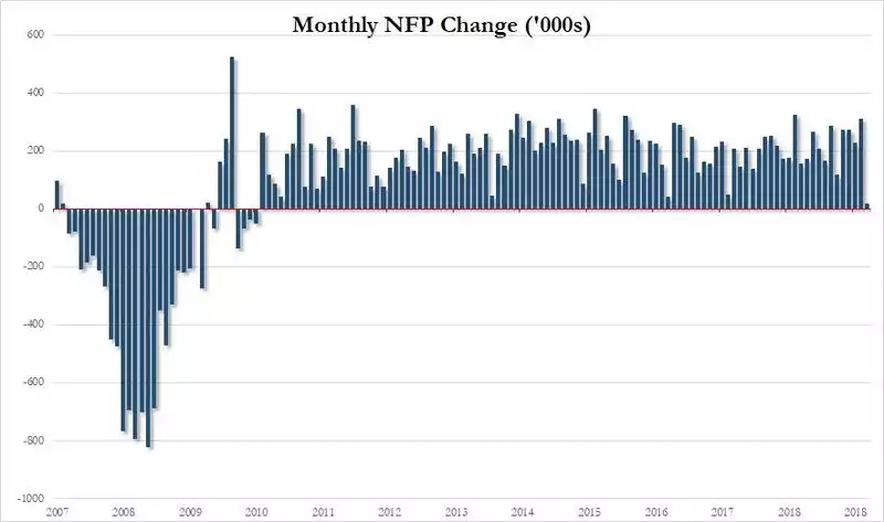
Despite the huge pullback in new jobs, the average hourly earnings headline actually increased to 3.4%. So in effect it was a double hit of poor jobs growth indicating businesses pulling back on growth fears and then hourly earnings indicating less profit for businesses and more threat of inflation (meaning the Fed may have to tighten). But… we said headline earnings, because behind that headline we actually saw hours worked decrease and resulting weekly earnings actually dropping. Maybe that contributed to a late day rally leaving the Dow just 22 points down.
That said, it continues a general market rollover that started a couple of weeks ago. It seems too that the smart money is getting out despite the rally that has bounced off that 4 January low, with Bank of America Merrill Lynch reporting we have seen the worst start to a year for equity outflows since 2008:
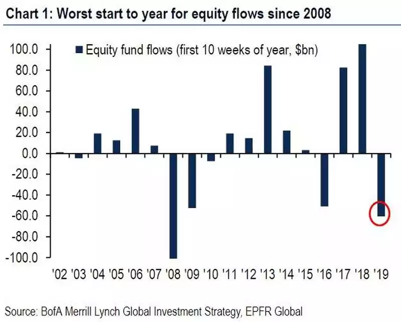
Those outflows in 2008 beat the full onset of the GFC by a few months and so need to be watched carefully as the ‘crowd’ got sucked into the crash back then whilst those early exiters kept their money.
The following chart highlights the historical disconnect with the current rally and outflows.
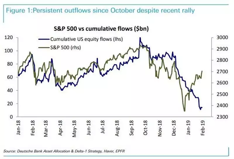
If that chart above doesn’t scream a warning, we’re not sure what will.
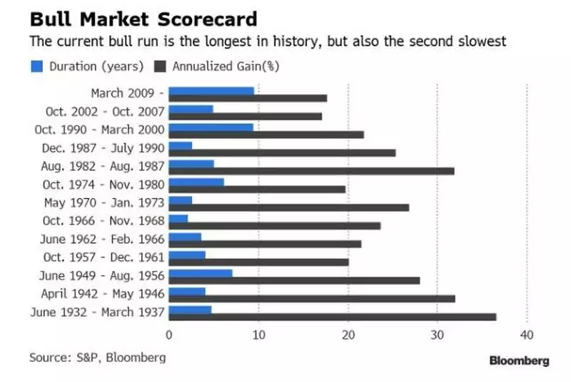
This all happens as the weekend heralded the beginning of the last 10 year bull run of the S&P500, the longest in history (though came within 0.2% of a 20% correction at the end of last year). However this bull market is unique in that is has been driven principally by a combination of central bank stimulus and corporate share buybacks, neither of which provide a foundation of strength. The chart below shows that whilst this bull run is the longest, it is actually the second weakest.
Taking on board all of the above you could easily conclude we have the mature signs of a market crash dead ahead. The severity of that crash may be influenced by the fact there is little support below the ‘everything bubble’ we have now. Rather, all we have done since the last debt borne crash is add over 50% more debt. The anaemic real growth behind this bull run means central banks have not had the ability to hike rates and unwind balance sheets in preparation to abate the next crash by easing them. The emperor has no clothes and the tide is heading out.