Australian Property - Some Warning Signals
News
|
Posted 02/12/2016
|
6529
Since mentioning The National Property Research Co.’s tweet on the definition of stupidity a couple of days ago we have looked at financial markets and the US property market.
As we discussed in today’s Weekly Wrap podcast, yesterday we saw the headlines that Corelogic’s latest report showed Melbourne apartment prices crashing 3.2% in November and housing down 1.5% in general as early indications of stress in the broader property bubble.
We promised to share NPR’s graphs so here they are. Whilst they are largely self explanatory, on apartments NPR will be the first to point out that this does not necessarily flow through to detached residential. That said one can’t rule out contagion and as Marc Hanson said “bubbles and busts don’t happen in “isolation””…
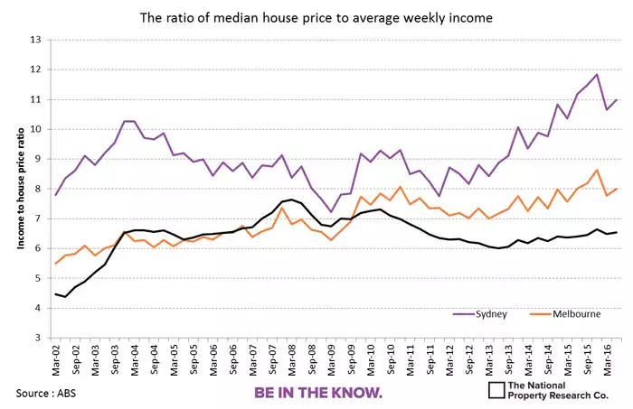
Yesterday we talked about affordability and these first 2 charts speak to that:
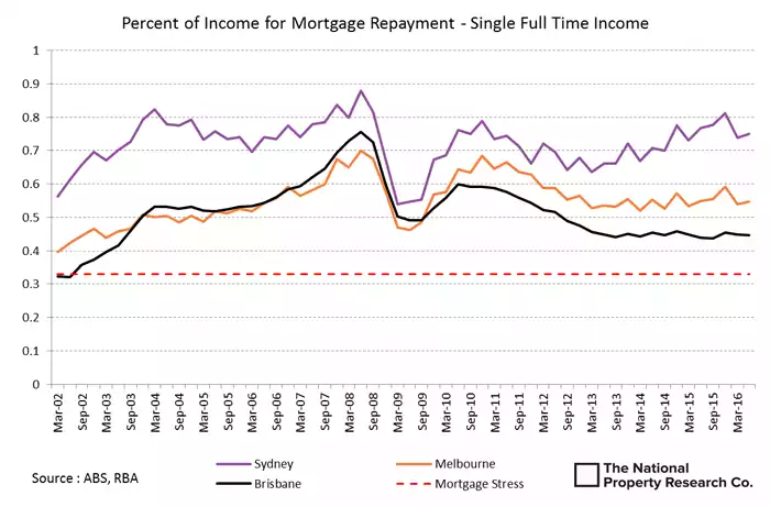
(note the black line is Brisbane)
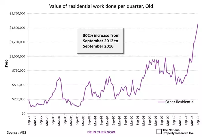
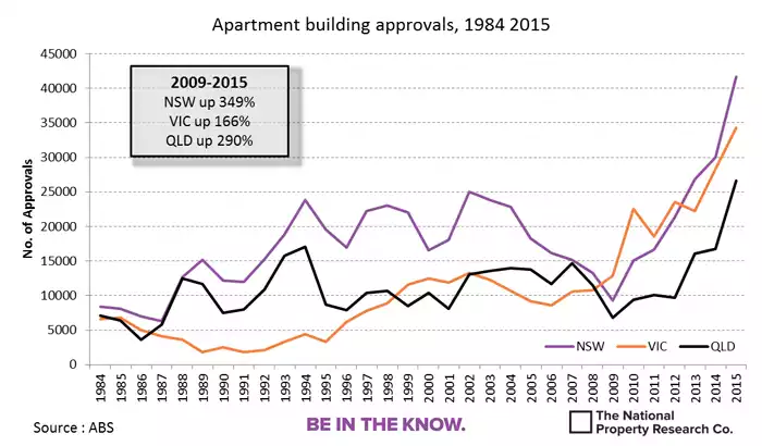
On the shear amount of supply coming on….
And finally the phenomenal growth in debt financed investment lending:
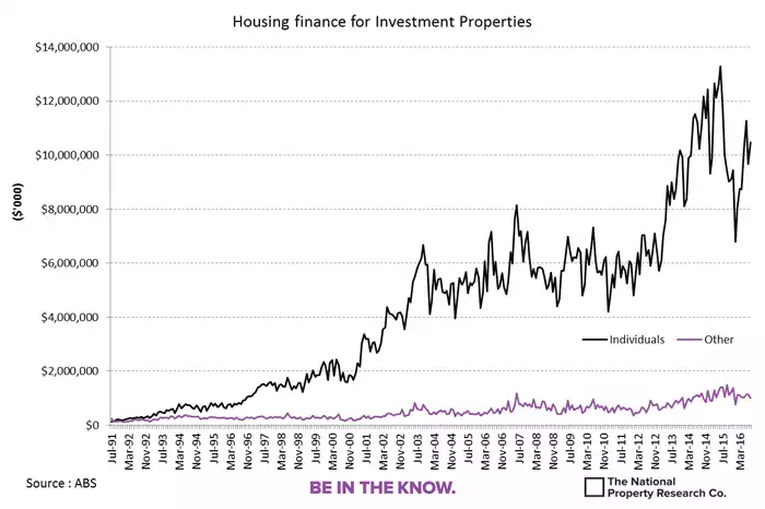
The big question is how all that investment debt handles increasing interest rates (courtesy of bond prices collapsing around the world and talk of central banks tightening) whilst supply is surging, rental yields contracting, and prices looking to be topping. The following chart should be at the forefront of investor’s minds. It shows the staggering amount of debt held by Aussies and how low interest rates have held the real cost of interest below previous peaks. Should the aforementioned march of bond yields and expectations of central banks starting to raise rates play out, the interest on the record high debt pile could be devastating.