A Warning Signal – Gold/Oil Ratio v VIX
News
|
Posted 17/08/2016
|
6822
It is said the 4 most expensive words in investment are ‘this time is different’. With that in mind take a look at the chart below… Over the last decade there has been a fairly strong correlation between the gold/oil ratio and the VIX (S&P 500 Volatility Index). The spikes you see coincide with financial market turmoil – with the obvious GFC spike and more recently last August and this January/February’s routs.
Within the circled area you will note a curious divergence underway with gold/silver high even after gold’s recent minor correction but the VIX on the decline and well under the ‘panic 20’ line. Everything appears to be awesome…
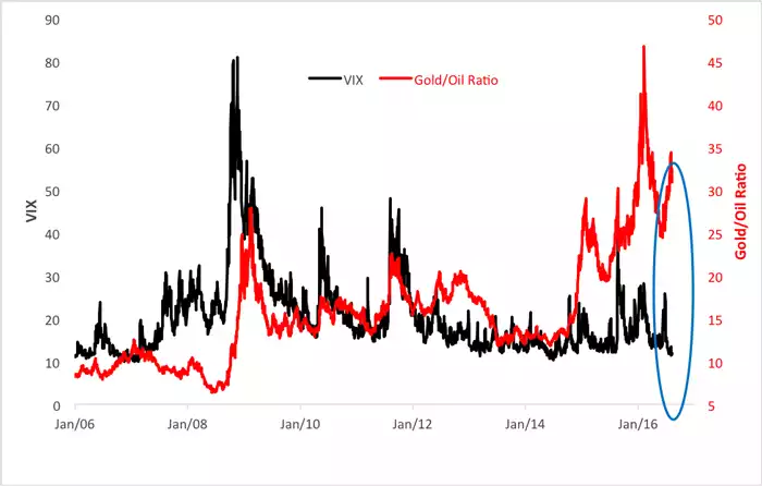
So… in a world where we have just seen the amount of global negative yielding government bonds exceed $13.4 trillion, last week seeing the 667th interest rate drop since the GFC, quantitative easing (money printing) at all-time highs, central banks and companies themselves the big buyers of shares, debt levels more than 40% higher than before the GFC, insurance and pension funds becoming massively underfunded ($trillions), $1.5 trillion of bad debt in Euro banks, share indices reaching new highs and EPS measures sky high with falling earnings, and anaemic economic growth worldwide at rates less than the debt accumulated to achieve them… which line do you think you should take as an indicator of what’s about to come? What’s your bet…. red or black?