7 Must See Charts for Gold & Silver
News
|
Posted 24/07/2020
|
11894
Pictures paint a thousand words so today we succinctly present 7 charts laying out the value proposition for both gold and silver right now.
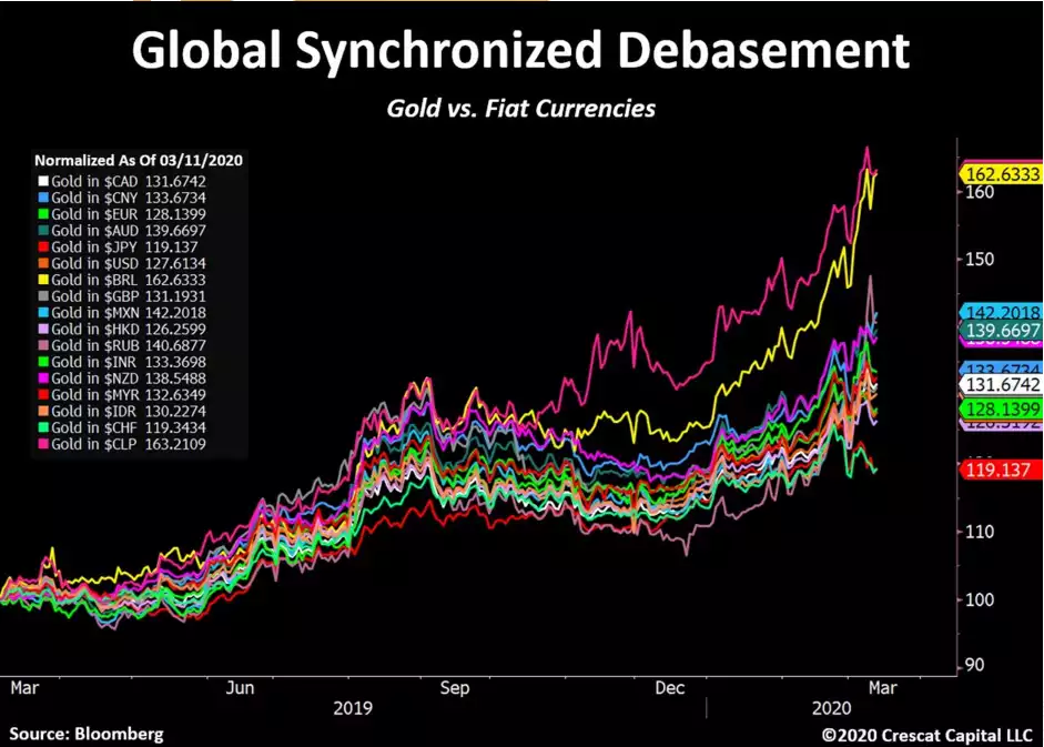
Yesterday we spelt out the reasons for this latest surge in the gold and silver price. One of the reasons was the debasement of fiat currencies through monetary stimulus and expansion programs by central banks and governments around the world. The chart below illustrates clearly how 17 currencies from all around the world have fallen in real monetary terms against real money…. gold.
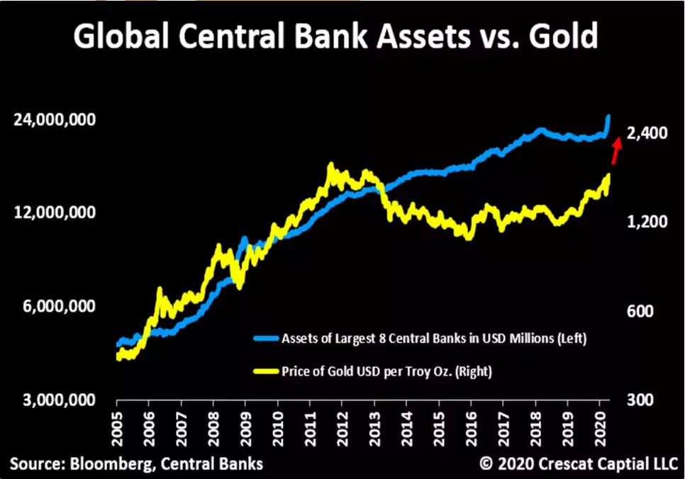
Gold kept in step with central bank asset (bond debt) expansion up until 2013. At that point the market started to think maybe all this monetary debasement wasn’t going to lead to broader inflation after all. Indeed it looked like all it would do is inflate shares so why ‘fight the Fed’, let’s roll in to shares…
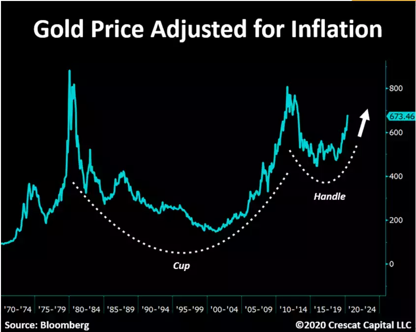
Zooming out, and for those who like technical set ups, the authors of these charts, Crescat Capital say:
“Inflation hasn’t even picked up yet. Meanwhile, the chart of the gold price adjusted for CPI since the 70s, looks like one of the largest and longest cup & handle charts we have ever seen. In other words, both the nominal and the real price of gold could be poised for a breakout.”
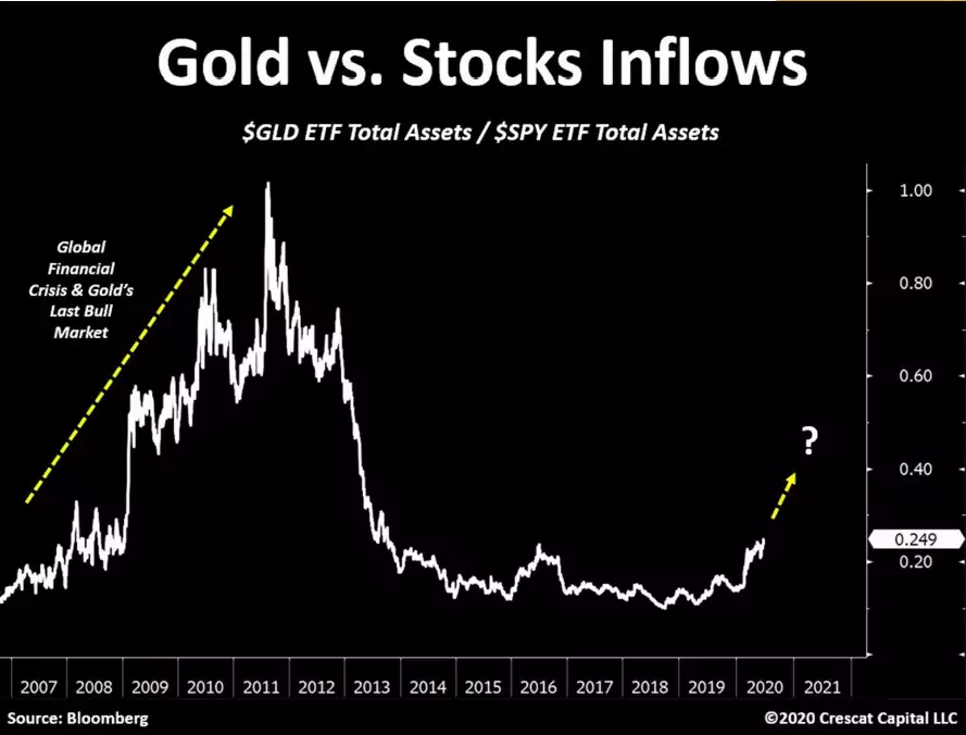
The massive and record breaking inflows to gold and silver ETF’s of late has been extensively spoken about (both gold and silver). However when measured against the same for S&P500 ETFs you can see the enormous potential still ahead:
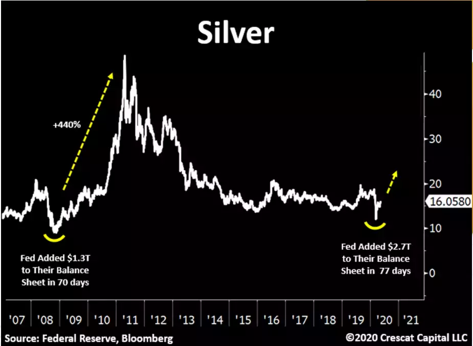
As we’ve written recently, whilst gold bottomed in late 2015, silver may have only just found its bottom in March of this year. The chart below illustrates what happened last time silver bottomed, with Crescat noting:
“In 2008, the Fed printed $1.2 trillion in four months and silver went parabolic over the next two years. It just created 2.3x the 2008 levels. We believe there is a timely and tremendous opportunity ahead.”
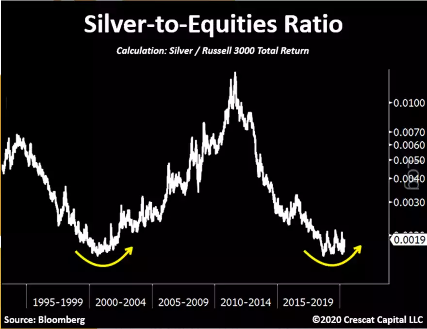
In the context of the S&P500 being so completely and unprecedentedly dominated by the FAAMGs, the chart below compares where silver is compared to ‘normal’ shares as measured by the broader Russell 3000 index representing 3000 companies not 500 (dominated by 5) and hence a broader measure of economic health of the sharemarket:
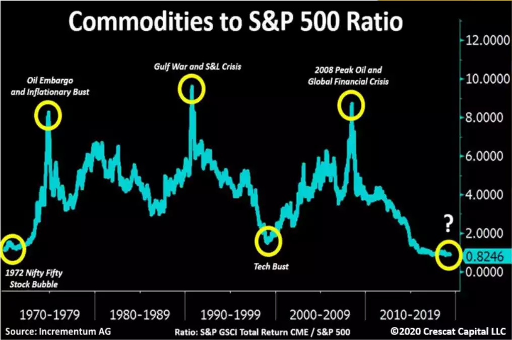
Silver of course wears 2 hats, it is half monetary metal half industrial metal. The chart below of the full commodities index against the S&P500 both explains in part why silver has been late to the party and that Gold Silver Ratio got so unprecedentedly high. Silver is a relatively tiny market and the sheer monetary demand has overcome the weak industrial fundamentals. However a bottom in this commodities index is looking close, a rebound off of which would add further wind to silver’s sails.
The charts tell the story. The stage is set. On many metrics this rally in both metals may relatively only just be starting.