5 ‘Must See’ Charts
News
|
Posted 21/12/2016
|
5825
History doesn’t always repeat, but it often rhymes… So let’s look at 5 charts comparing now to the last time the US Fed raised rates, this time last year (courtesy of Kevin Muir)… Last year is in white, this year in blue…
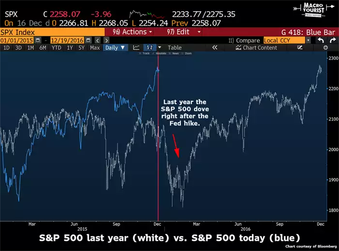
First the biggest share index in the world, the S&P500 which managed to stay strong for a week after the Fed hike, and then had its worst new year in history…
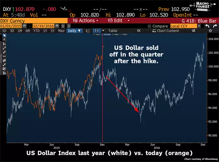
Pretty much the same for the US dollar, holding strong into January before falling into May…
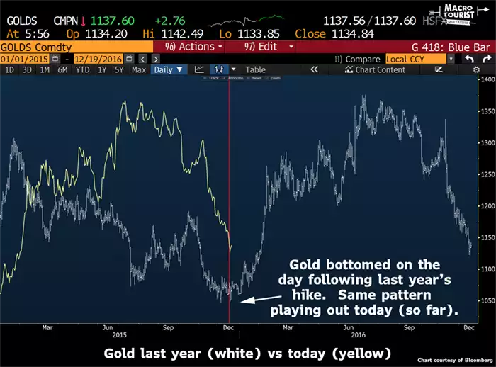
Gold reacted more immediately last year. If you recall, much like the commentary today, the Fed hike was going to ‘smash’ gold into the 900’s. Well gold in fact bottomed that day and started a new rally…
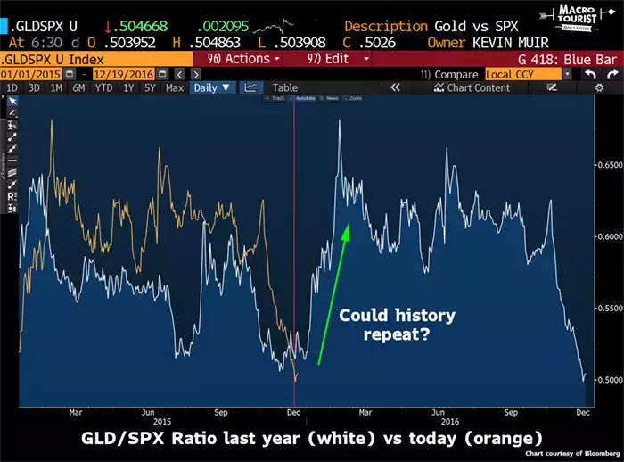
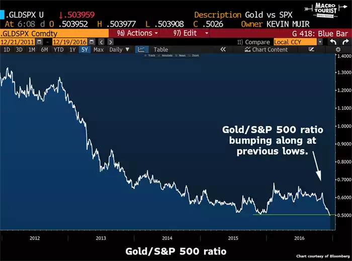
Combining the two and the Gold/S&P500 ratio is hitting the same bottom now as well…
Zooming in to compare last year and this year, including the gold price, and it begs the question imbedded in the graphic…