10 Charts Mapping the Decline of the US
News
|
Posted 07/06/2016
|
5636
Yesterday we reported on the US jobs report that saw the USD tank 2% whilst gold rose the same. That jobs report reinforced what regular listeners to our weekly podcast already know, and that is, the real US economy is a long way from being ready for a rate rise. Last night Wall St advanced 0.6% with the S&P500 hitting a 7 month high after Fed Chair Yellen reassured markets they would only raise rates gradually and only once the data supported that. More jaw-boning, free money for longer, lets all pile back into stocks*… Gold stayed firm.
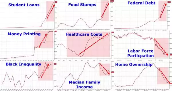
The charts below have been doing the ‘web rounds’ of late but if you’ve missed them they are a telling set of ‘real world’ metrics. Their genesis was politically motivated as it sets out what has happened on Obama’s watch (shaded zones). The reality however is that most of it (apart from health care pre ‘Obamacare’) was on its way to this before he even started. This is a systemic political problem, not one of either ‘colour’. We are seeing exactly the same play out in the lead up to our federal election in July. The fact is the solution is hard and no politician relying on re-election wants to be the one to implement it.
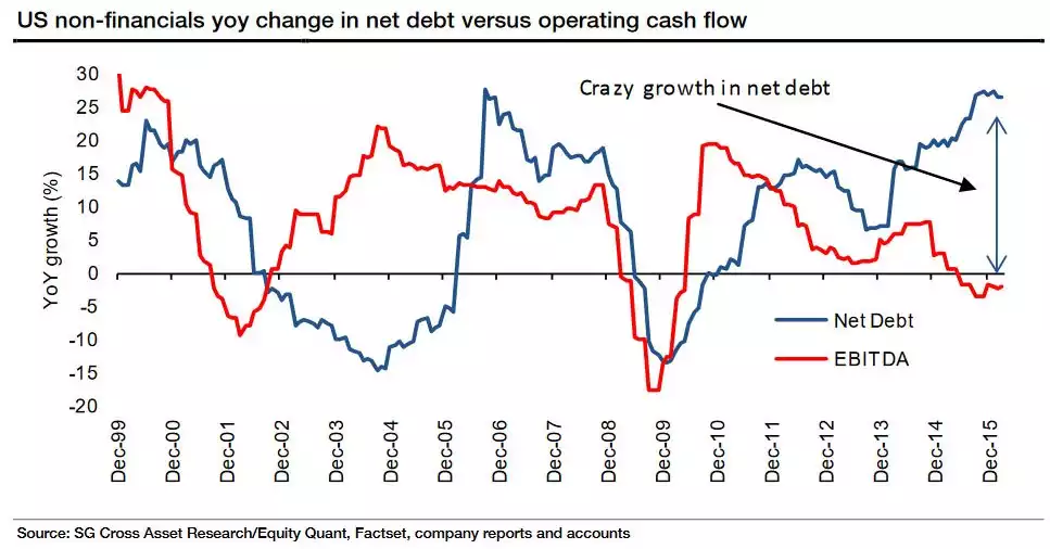
* As we’ve reported recently a very large portion of share purchases are by the company’s themselves not investors, so take “all” above with a grain of salt. It may well have been companies taking on more debt to buy more of their own shares. Recall the graph below which paints a very scary, unprecedented picture…