Long term gold chart
News
|
Posted 04/04/2014
|
4404
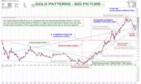
This chart doesn’t need much preamble, it’s a self explanatory picture of a market looking like it’s hit a bottom. For further context though: consider sharemarkets are at very high P/E ratios and above many technical lines and the Gold/S&P500 ratio is very low. To get a quick snap shot of the driving fundamentals for gold and silver just check out today’s Weekly Wrap radio broadcast.