What Happens When the Rug’s Pulled?
News
|
Posted 17/03/2017
|
4085
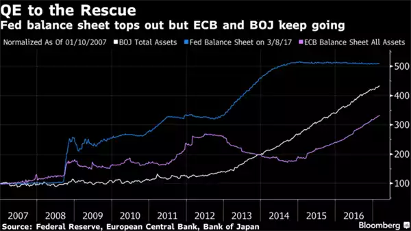
As we discussed in today’s Weekly Wrap the Fed was a little elusive this week about when they might look to reduce the $4.5 trillion of US Treasuries they bought to print all that money from 2009. Whilst the US Fed stopped it’s QE program at the end of 2014, the Bank of Japan (BoJ) and European Central Bank (ECB) have gone hard since, to the tune of US$200b/month currently. No one seems to talk about the more opaque China but even on rough estimates they dwarf all.
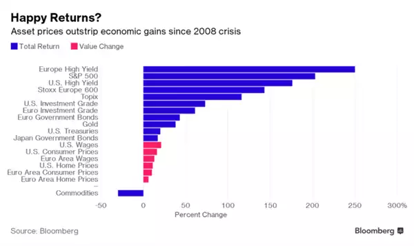
There is no doubt all this money printing saved the world from the GFC fully playing out. Few understand just how close it got to being a LOT worse before central banks jumped in and bailed out the system. So what happens when you inject that much money into the ‘system’? Who are the winners? The graph below goes a long way to explain the Brexit, Trump, One Nation, and Euro far right phenomenon. It has enriched Wall Street and left Main Street behind.
But it begs the much bigger questions of:
- What happens to all those financial assets when its turned off (whilst the BoJ is not flagging any reprieve the ECB is due to stop QE this December); and
- When will all those $trillions of freshly injected money see inflation take off (as Economics 101 says it must)
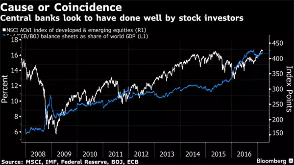
The cynical title of the next graph probably answers 1….
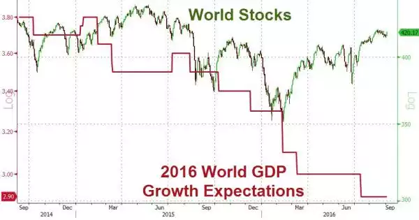
Especially in the context of world growth …
And as for 2., well that is clearly just starting to play out now, for despite the Fed maintaining that inflation is only just near its 2% target and manageable (and again extensively covered in today’s Weekly Wrap) there are very clear signs of real inflation and more concerning stagflation as it is happening in a near zero wage growth and weak economic growth environment.
The big bogey is that all this cheap money has seen $60 trillion of global debt added since the GFC, ironically a crisis brought of too much debt. Removing this support sees the cost of that debt increase at a time that the wage growth and the economic growth are not there to support it.
Rather than taking the medicine at the GFC, central banks have arguably created a much bigger monster and spent all their ammunition doing so. There may be no silver bullet next time.
We are going to break tradition here (but it’s a Friday and you have all weekend….) and provide the following addendum to today’s news for you to read if you wish. It is somewhat technical and long but we think it essential reading to gauge a bit more of what we’ve just said. It’s courtesy of Doug Noland’s Credit Bubble Bulletin and is only part of a much longer piece (here if you want to read the whole thing). If there is one takeaway, please note the constant comparisons with the amount of debt taken on last year compared to just prior to the GFC.
“New Fed Q4 Z.1 Credit and flow data was out this week. For the first time since 2007, annual Total Non-Financial Debt (NFD) growth exceeded $2.0 TN – a bogey I’ve used as a rough estimate of sufficient new Credit to fuel self-reinforcing reflation. Based on some nebulous “neutral rate,” the Fed rationalizes that it’s not behind the curve. Robust “money” and Credit growth argues otherwise. A Bloomberg headline from earlier in the week: “Taylor Rule Suggests Fed is About 12 Hikes Behind.”
Though not so boisterous of late, there’s been recurring talk of “deleveraging” – “beautiful” and otherwise – since the crisis. Let’s update some numbers: Total Non-Financial Debt (NFD) ended 2008 at $35.065 TN, or a then record 238% of GDP. NFD ended 2016 at a record $47.307 TN, an unprecedented 255% of GDP. In the eight years since the crisis, NFD has increased $12.243 TN, or 35%. Including Financial Sector (that excludes the Fed) and Foreign U.S. borrowings, Total U.S. Debt has increased $11.422 TN to a record $66.079 TN, or 356% of GDP. It’s worth adding that the $2.337 TN post-crisis contraction in Financial Sector borrowings was more than offset by the surge in Federal Reserve liabilities.
For 2016, NFD expanded $2.117 TN, up from 2015’s $1.929 TN - to the strongest growth since 2007’s record $2.501 TN. Household borrowings increased $521bn, up from 2015’s $384bn, to the strongest pace since 2007’s $947bn. Household mortgage borrowings jumped to $248bn, up from 2015’s $129bn. On the back of an unusually weak Q4, total Business borrowings declined to $724bn last year from 2015’s $812bn (strongest since ‘07’s $1.117 TN).
The Bubble in Federal obligations runs unabated. Federal debt jumped $843bn in 2016, up from 2015’s $725bn increase to the strongest growth since 2013’s $857bn. It’s worth noting that after ending 2007 at $6.074 TN, outstanding Treasury debt has inflated more than 160% to $16.0 TN. As a percentage of GDP, Treasury debt increased from 42% to end 2007 to 86% to close out last year.
Yet Treasury is not Washington’s only aggressive creditor. GSE Securities jumped a notable $352bn in 2016 to a record $8.521 TN, the largest annual increase since 2008. In quite a resurgence, GSE Securities increased almost $1.0 TN over the past four years. Treasury and GSE Securities (federal finance) combined to increase $1.194 TN in 2016 to $24.504 TN, or 132% of GDP. For comparison, at the end of 2007 Treasury and Agency Securities combined for $13.449 TN, or 93% of GDP.
The unprecedented amount of system-wide debt is so enormous that the annual percentage gains no longer appear as alarming. Non-Financial Debt expanded 4.7% in 2016, up from 2015’s 4.4%. Total Household Debt expanded 3.6%, with Total Business borrowings up 5.6%. Financial Sector borrowings expanded 2.9% last year, the strongest expansion since 2008.
Securities markets remain the centerpiece of this long reflationary cycle. Total (debt and equities) Securities jumped $1.50 TN during Q4 to a record $80.344 TN, with a one-year rise of $4.80 TN. As a percentage of GDP, Total Securities increased to 426% from the year ago 415%. For comparison, Total Securities peaked at $55.3 TN during Q3 2007, or 379% of GDP. At the previous Q1 2000 cycle peak, Total Securities had reached $36.0 TN, or 359% of GDP.
The Household Balance Sheet also rather conspicuously illuminates Bubble Dynamics. Household Assets surged $6.0 TN during 2016 to a record $107.91 TN ($9.74 TN 2-yr gain). This compares to the peak Q3 2007 level of $81.9 TN and $70.0 TN to end 2008. Q4 alone saw Household Assets inflate $2.192 TN, with Financial Assets up $1.589 TN and real estate gaining $557bn.
With Household Liabilities increasing $473bn over the past year, Household Net Worth (assets minus liabilities) inflated a notable $5.518 TN in 2016 to a record $92.805 TN. As a percentage of GDP, Net Worth rose to a record 492%. For comparison, Household Net Worth-to-GDP ended 1999 at 435% ($43.1 TN) and 2007 at 453% ($66.5 TN). Net Worth fell to a cycle low 378% of GDP ($54.4TN) in Q1 2009. In terms of Credit Bubble momentum, it’s notable that Net Worth inflated over $2.0 TN in both Q3 and Q4.”