Recession v Rate Rise 2
News
|
Posted 06/08/2015
|
4154
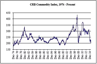
Yesterday we included a chart overlaying factory orders with previous recessions (shown as pink bands). We invite you to look at the following chart in that same light and see if you spot a similar trend. Below is the CRB Commodity Index mapped since 1974. As you can see we are well into a serious decline. Now overlay the pink recession bands from yesterday and see what you find… As with yesterday’s Factory Orders, you can see that such declines have coincided with recessions in the past.
The Australian Financial Review today has a front page caption “Reality Check – Investors are not ready for a Fed rate hike yet”. It goes on to report the fear of “disruption” (the understatement of the day) in markets should the September hike happen.
The charts of above and yesterday tell a clear story, and whilst only part of the economic puzzle they are not alone. More importantly they indicate a market in decline and last time that happened they stimulated it with more QE. So ironically whilst the world is fixated on whether or not there will be a rate rise, some are asking when will QE4 start? The chart below might tell you this is not so fanciful a concept….