Negative Real Rates to Stay – Music to Gold’s Ears
News
|
Posted 30/07/2021
|
6270
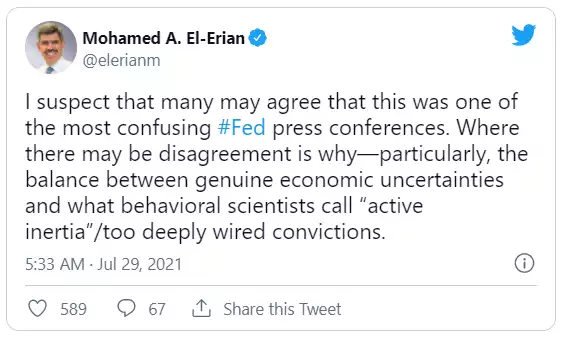
Concerns of the Fed ‘tapering’ its QE program or raising rates were largely alleviated this week through a couple of events in the US worth noting.
First we had the latest Fed meeting 2 days ago which for many was just plain confusing.
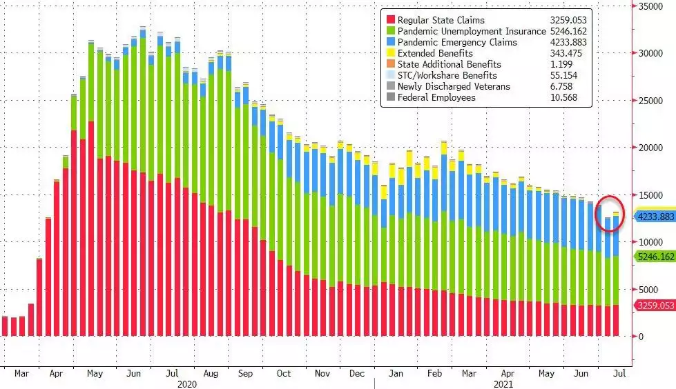
Why? When one is as trapped as the Fed, one needs to duck and weave. But probably the clearest takeaway is that they are keeping the pedal to the metal with monetary stimulus, almost completely discounting inflation concerns and so putting it all on their maximum employment mandate where they need "substantial further progress" before any tightening. Now that might seem strange to you when their headline unemployment figure is so low? But that discounts those that aren’t actually being counted through ‘participation’. This week we saw more disappointing jobless claims data, coming in worse then expected for a second week and on the rise. For context, below is the number of Americans still on some sort of dole (the green and blue COVID relief payments), rising above 13m again after a gradual fall from the mind boggling 33m in the initial lockdowns:
And then last night we saw a disappointing Q2 GDP print of 6.5% when 8.5% was expected. Yes that is a huge number but remember the base effect for a year on year % when the US was in the depths of the deepest recession in history a year ago. 6.5% is also a stalling given last quarter was 6.4%.
When looking at this we must remind ourselves of the context of the 3 core economic metrics of: the Fed balance sheet as a proxy for new money supply; GDP as a measure of real economic growth; and the US sharemarket that in theory should dance around the GDP line with unders and overs as it cycles (you remember natural cycles yeah?). The following chart so clearly illustrates the grotesque disconnect between GDP and the entire US sharemarket (beyond the top 500 in the S&P):
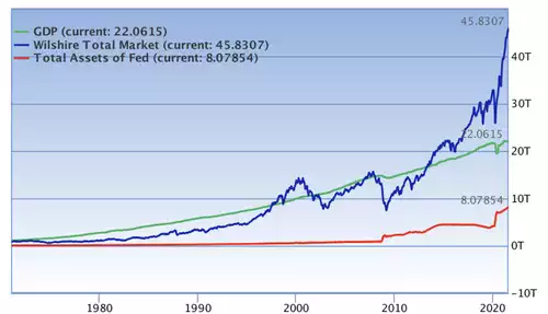
Blind Freddy can see the impact of the monetary stimulus in red pumping the sharemarket in blue beyond fundamentals around GDP in green. That there is an historic positive correlation between the price of the sharemarket and unemployment means the temptation is to continue.
This of course exacerbates the already deeply socially disturbing wealth inequality gap issue around the world. Chart author Sven Henrich of Northman Trader explains:
“Why? Because popping the largest asset bubble ever would result in a catastrophic reset, not only a recession, but a depression.
The reality is debt levels have so exploded in the past 13 years any pre GFC type interest rates (which were historically low back then) would collapse the entire system. They know it. I know it, you know it. The entire system is predicated on debt expansion and cheap money to sustain it. That’s it.
The only way to avert disaster is to keep expanding wealth inequality, disconnect asset prices from the economy ever further and keep telling everyone they do it for the downtrodden while the bottom 50% are the ones actually taking the bath with permanent price increases while their wages are not keeping up.”
How? Well as the legendary Mohamed A. El-Erian observed “the Fed will most likely continue to disconnect asset prices even more from fundamentals. Wealth inequality will worsen more. The Fed's monthly purchases of $40B of MBS [mortgage backed securities] will continue to price people out of the housing market.”
In other words (and Sven’s to be exact) – “Asset price inflation for the rich. Consumer price inflation for the poor.”
History is littered with broadscale social revolts and ensuing ‘resets’ when this distortion reaches tipping point.
The inevitable outcome too is prolonged negative real interest rates. Deutsche Bank credit strategist Jim Reid recently plotted the history of US 10 year real yields (nominal yields less inflation). TIPS only go back to 1997 so he used a combination of subtracting spot inflation from spot 10yr yields through time, and likewise a rolling 5yr average of inflation from spot 10 year yields. The following resulting chart shows we have not seen such extreme negative real yields in 70 years!
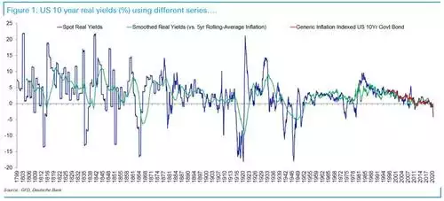
Where to from here? In his words:
"I’ve been on record over the last few years for saying that with debt so high real yields are likely to stay negative for the rest of my career as the authorities have to control funding this rising leverage. I’m even more convinced of this post pandemic." And “"positive US real yields for any length of time would likely set off debt crises around the world so we are probably stuck with the regime."
Even if the Fed lose control and yields rise, the accompanying inflation will keep it stuck, to wit, “real yields will stay notably negative, followed by a view that inflation will be higher going forward than it was over the last decade.”
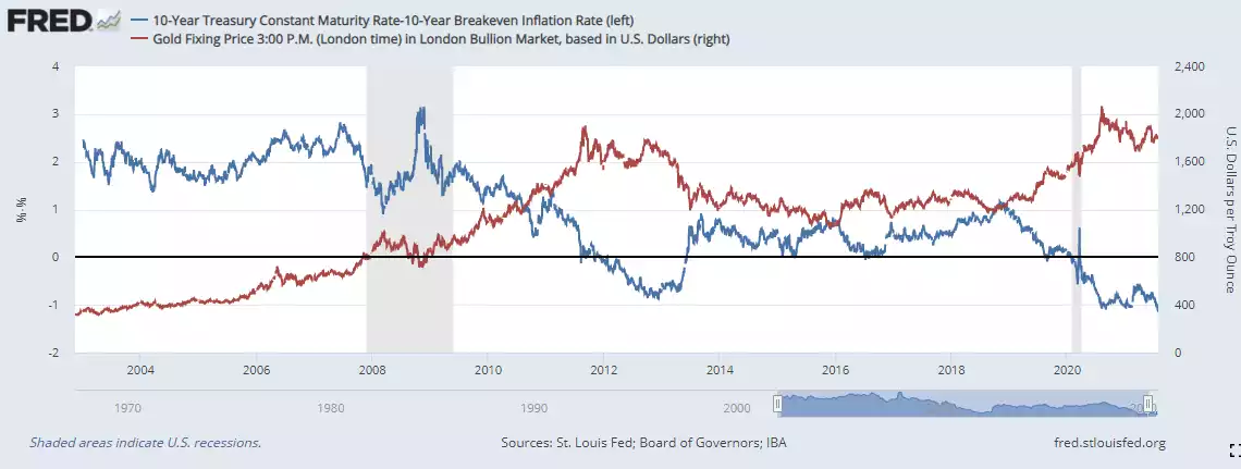
One of the most highly (negatively) correlated relationships you will see is the gold price and negative real yields. As we discussed yesterday, the gold bull market is likely just getting going…