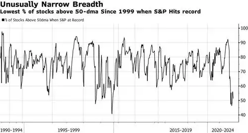
Running out of breadth… “weakest ever witnessed”
News
|
Posted 23/07/2021
|
6888
Morgan Stanley’s chief equity strategist recently published a client note calling the current US sharemarket breadth "the weakest we have ever witnessed”. Nothing since the dot.com bubble has come close to the current set up and he is predicting it will lead to a "material correction", one of many such calls around the current US sharemarket.
The last time we wrote of this metric was back at the end of July 2018. In our article ““BAD BREADTH” – WHY FANGOVER MATTERS” we pointed out the same dynamic but at much better levels than the current set up. Of course we now know that the market crashed badly not long after that article, and importantly that crash was catalysed around the same QE tapering that is being touted now…
Market breadth is measured by the percentage of companies in an index, in this case the biggest index, the S&P500, that are trading above the 50 day moving average. The lower the percentage the more concentrated a market is to reach he headline number. The graph below clearly illustrates the extent of the problem where you can see that whilst still slightly better than the low of 47% hit at the end of June when the S&P500 hit another all time high, the current measure is still historically abysmal.
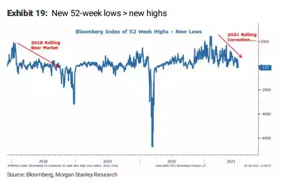
Such is the bifurcation of the market, that at the same time as shares are hitting all time highs, there are more shares hitting new 52 week lows than those hitting highs. As you can see in the chart below that is a trend that has been rolling more bearish since the beginning of the year, just as it was in 2018.
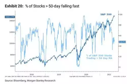
Zooming in on the first chart above and with the S&P500 price overlaid, you can see that the ‘usual’ rebound of the breadth indicator after a correction just hasn’t happened and hints that worse is yet to come.
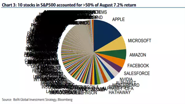
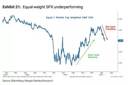
His next chart (Exhibit 21) is very interesting and gives further insight to this dynamic. Obviously the S&P500 is an index of the top 500 US shares. As we have written before (last time here) there is a massive concentration of the tech FAAMG’s in that index and they, as so called growth shares, have also massively outperformed. You might recall the following incredible chart from that linked article.
And so when you look at the S&P500 on equal weighting as opposed to weighting by market cap you get an insight into the dominance of the big players but also into where you may be in the cycle. As Morgan Stanley point out now, that ratio is rolling over this last couple of months in a big way:
And finally they present the following chart which measures so called ‘cyclical’ versus ‘defensive’ shares. As the name suggests, cyclical companies are those that are more affected by economic trends rather than defensive which tend to be companies that grind through any macro economic environment as they may produce what you’d call staples, i.e. things you need rather than want. You will note below that this too is rolling over very sharply.
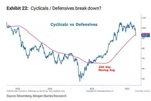
They note: “while the ratio of cyclical to defensive stocks rolled over at about the same time, we called for the mid-cycle transition back in March, it completely broke down last week, signaling we may now be entering that more vulnerable time for the index – i.e.a much more defensive rotation."
You will note that gold too bottomed in March and has been rallying in line with that vertical drop in the chart above over the last couple of weeks.
Fundamentally Morgan Stanley believe the recovery part of the business cycle is over, we are in the mid cycle transition now which “usually precedes a material index level correction that marks the end of it.". This is very similar to Raoul Pal’s view that we shared this week where he expects a weakening economy in this second half of the year.
This highlights a few key points. This US sharemarket, the one that all follow whether they like it or not, is looking decidedly shakey. The headline outperformance has largely been lead by a few big growth shares and others benefitting from the monetary stimulus. However that is turning and as usual gold is all over it. One of gold’s key value propositions is that it is uncorrelated with shares, it goes up when they go down. That at times appears to break down with both rising in unison. The analysis by Morgan Stanley above highlights that sometimes gold looks beyond the headline number and can see the trouble brewing below it. That most definitely appears to be the case now. And so whilst the S&P500 hits new highs, it is a high with little support below, indeed (per the 1st chart above) near record low support below.