Just Like Before The Great Depression
News
|
Posted 30/11/2017
|
6794
Balancing your wealth is not always as simple as some funds make out. The old 60/40 passive fund of 60% S&P500 and 40% US 10yr Treasuries, with the latter your ‘safe haven’, is not really playing out like it should now. Back in June we showed you a diagram showing the relative performance of all major asset classes since 2000.
Real balance is about assets being uncorrelated. Bonds are not acting that way in this ‘everything bubble’. Gold on the other hand is up just 6% in AUD terms this year, silver almost even. That, dear reader, is an uncorrelated asset doing exactly as it should. When financial assets crash, see how you feel about that lack of correlation then…
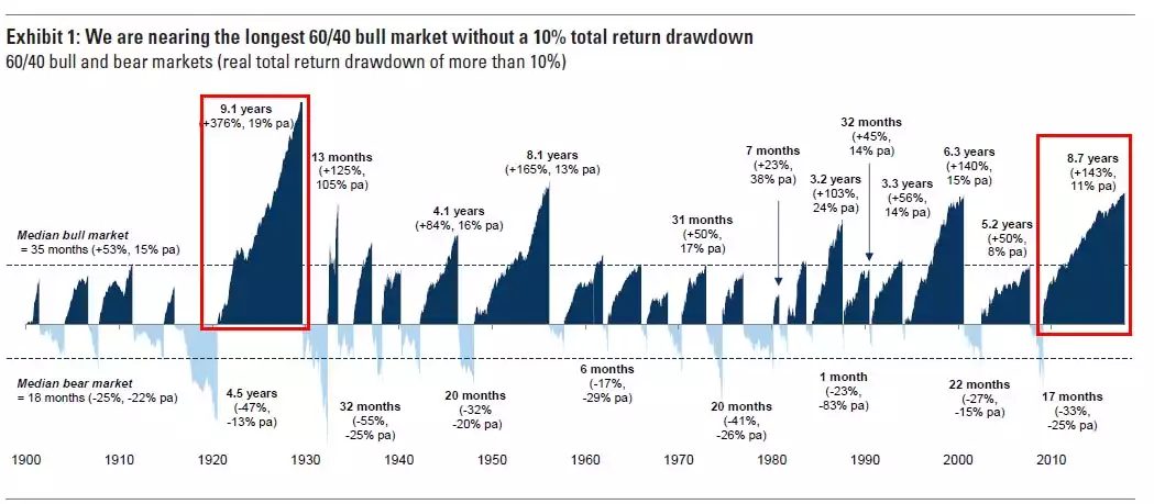
The following graphic from Goldman Sachs shows just how strung out this ‘everything bubble’ is… the 2nd most in history….and 2nd only to the prelude to The Great Depression….
It would appear now is not the time to be divesting the one asset class that could counter the inevitable….