Will This June Mark the Top? Next - The Insolvency Phase
News
|
Posted 24/06/2020
|
18404
We make no secret of the fact we think Raoul Pal, CEO and founder of Real Vision, is one of the better macro economic minds out there. His track record is hard to fault. Previously we outlined his The Unfolding thesis of where we are headed economically. Essentially he sees this as 3 phases.
The first is the liquidation phase that we saw in February and March where widespread panic sees everything sold off, even eventually the safe havens of gold and silver in large part sold to meet margin calls on investor’s shares etc.
The next is the hope phase, clearly playing out right now and since the end of March. This is the “V shape recovery” narrative, the “this time is different, it’s only a virus” narrative, and of course the “Fed’s got this” narrative. Whilst he didn’t predict it, we have also seen the Robinhood phenomenon of crowd hysteria. Topically, we can’t let the headline go yesterday regarding ‘trending day trader’ Dave Portnoy – “Daytrading Icon Portnoy Now Using Random Scrabble Letters To Pick A Stock”. The market is officially mad.
Whilst we are still clearly in the hope phase Pal sees this potentially ending shortly. Thereafter we go to what he calls the insolvency phase, where no amount of liquidity injections can save companies from going broke en masse on lower income and we see the long, horrific depression we saw in the 30’s. Yesterday we touched on that in the sense that a 90% recovery (if even realised) leaves a 10% gap which in an earnings sense is enough to bring many already struggling companies down. Topically, the following came to light yesterday. First the correlation between unemployment and commercial bank loan delinquency is both clear and alarming:

Secondly, last week’s US bankruptcies spiked the most since the GFC:

We wrote of Pal’s thesis last here in late May where history was indicating a June top in the market was a likely scenario. That article is a great summary before reading on today. And yet here we are in late June and whilst markets appear jittery there is no clear sign we are at the top of this hope rally, if indeed this is a hope rally. We will always remind you that no one person’s views are always correct. Indeed Pal is at lengths to say he is macro and macro doesn’t predict short term timings nor is it infallible. He rates the likelihood of his worst case scenario fully playing out at 60%. However in his latest update the charts are certainly still supporting this thesis. With respect to RV paying subscribers, lets look at just a few…
Firstly the insolvency phase is based on his theory of a debt deflation. A debt deflation is when the effective amount of all debt rises in real terms because of deflation. This is what central banks fear the most. As recently as yesterday we wrote of central banks efforts to increase inflation so that they can (ultimately) inflate away debt. It is in theory the only thing left other than a default or jubilee when your economy is too weak to actually repay it. Deflation is their worst nightmare and Pal believes that we are headed to this debt deflation outcome before it ultimately turns to inflation on the inevitable response. His so called ‘chart of truth’ is the long term chart of 10 year US Treasury Yields and its very clear trajectory toward zero and even negative yields. This is still well in play today:

The key issue then is the threat of positive real rates when they need them negative. Real interest rates are the result of subtracting inflation from the cash rate or bond yield. With the Fed rate at zero or negative and treasury yields zero or negative, if you have deflation (negative inflation), real rates turn positive and that is catastrophic for central banks trying to deal with the biggest debt loads in history and an economy in recession. If that happens, the money printing presses will go into hyper-brrrrrrr and hang on to your gold hat.
So what about the deflation piece? Firstly Pal updates his commodities chart and it’s still looking decidedly bearish. Weak commodities are the bellwether of deflation. They have now broken and held through the head and shoulders pattern he warned of in April.

Beyond commodities there is a host of deflationary validators in nearly every print from employment, to PMI’s, to earnings etc, all of which we have discussed in recent times. However Pal goes on to share some fascinating ‘non markets’ charts with incredible correlation painting a very deflationary picture.
First, and deeply structural, CPI (inflation) against our aging demographic issue:

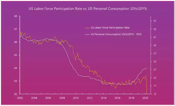
Second, and off our discussion last week about labour market participation rates, check out the correlation with the velocity of money. Remember if there is no velocity of money in the system, the Fed can print to its hearts content, but if no one is actually using all the new money you can’t get inflation. The resulting hyperinflation thesis down the track (after the debt deflation) is when all of a sudden velocity returns and there is all this extra money in the system buying the same amount of goods…

But it won’t stop the Fed trying…. Below shows the Fed’s balance sheet inverted against that same labour participation rate:

Why? Because if you don’t have a job, you stop consuming…
So where to for Labour Force Participation Rate? RV’s Global Macro Insiders analysts have a remarkable track record in predicting this and their forecast is dire:

And finally to illustrate the correlation between velocity of money and CPI the chart below portends deflation ahead:

He goes on to share sharemarket charts from some of the biggest crashes showing repeatedly bottoms in March and tops in June with new lows generally 30-60 days thereafter. He then points out that is potentially where we are right now.

And so we wait to see if that 11 June low is retaken and the 8 June top marking potentially the start of the next phase. All eyes are on a 3000 S&P500 and US treasury yields holding or trending lower.
Pal’s aforementioned ‘worst case’ scenario sees 80% losses and a depression not a recession. Only time will tell, but to be forewarned is to be forearmed through balancing your portfolio for such an outcome.