3 Very Bullish Silver Charts
News
|
Posted 21/03/2022
|
7740
Its Monday so let go easy on the words today and there a few charts on silver worth sharing. First let’s look at something that has only happened twice before since we left the gold standard. Silver’s so called “Lucky 7 Year Cycle” maps the 7 and 14 year moving averages for the price of silver. Each time the price has crossed from below to above both the 7 and 14 year moving averages to the upside it has heralded the start of bull runs for 7 years that have seen 2200% in the 70’s and then 730% over a few years either side of the GFC.
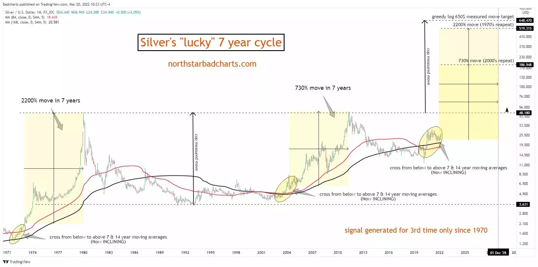
We have just had one such cross and if that were to play out like last time we are looking at either US$187/oz silver or US$519/oz over the next 7 years.
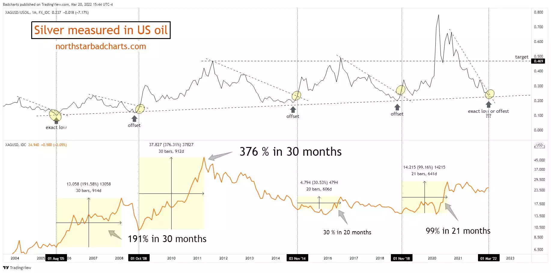
And of course one can’t look at any chart now without the context of oil. When silver is measured against the price of oil we are again at an historic juncture that has seen the start of a strong rally in the price of silver.
Likewise both silver and gold are real monetary alternatives to the grotesquely debased, highly weoponised, and until the news late last week, sole Petrodollar, US dollar. Late last week the Wall Street Journal reported that Saudi Arabia is in "active talks" with China to price some of its oil sales to China in yuan. The petrodollar agreement with the Saudi’s is fundamental support for the ailing USD and the news cannot be ignored. The chart below then becomes a WHOLE lot more relevant…
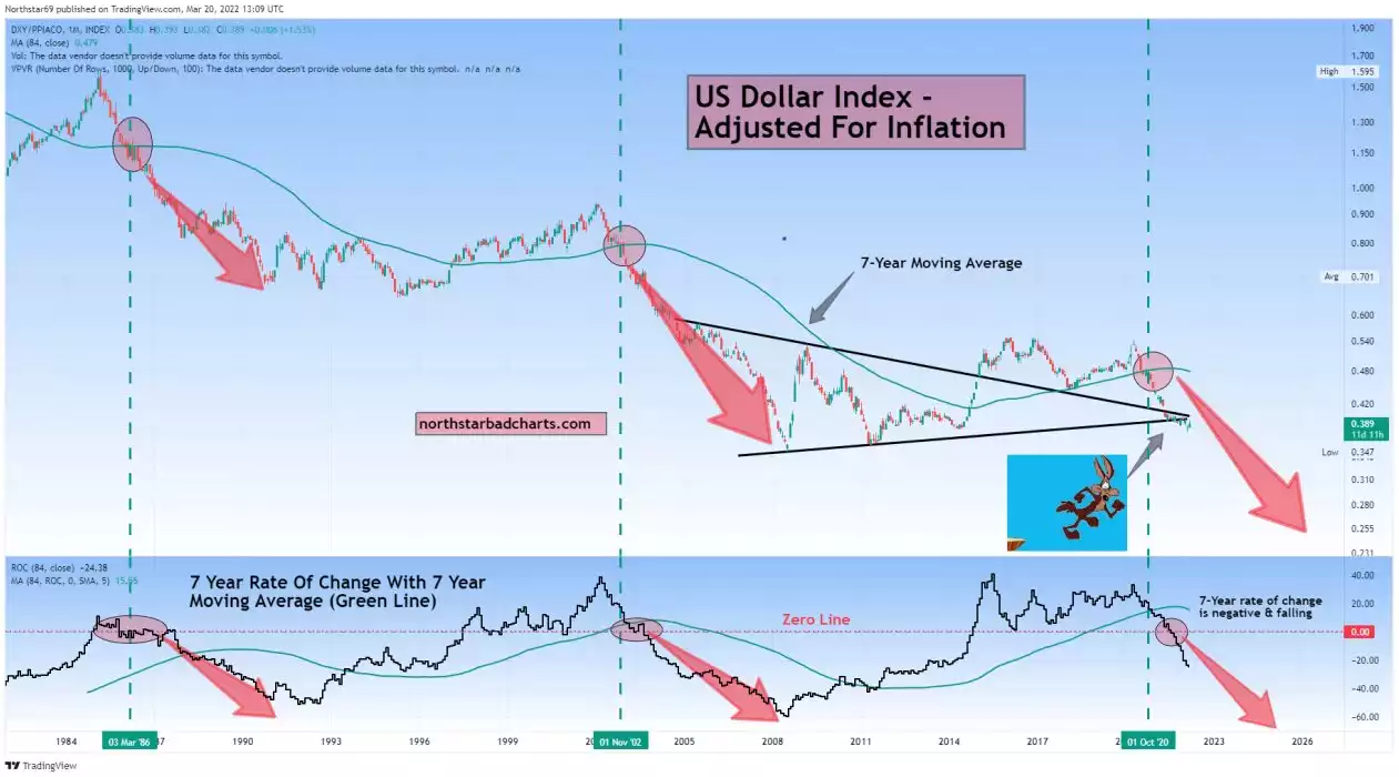
There are clearly many moving parts in this debt laden, geopolitically charged and central bank inflation responsive environment. However in the context of commodities shortages, rampant inflation, an energy crisis, and global kickback on a highly weoponised and debased reserve currency, one’s gut would be seeing a lot of sense in all 3 charts above.
More and more you see headlines around the world’s most undervalued assets in reference to silver and gold. The charts above certainly support such a proposition.